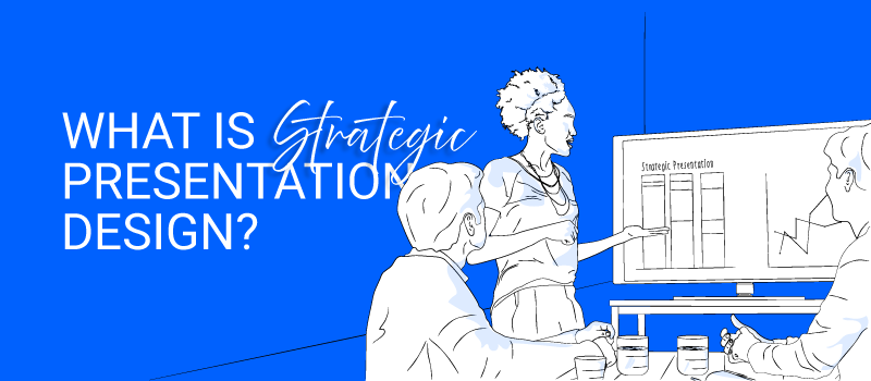
Strategic Presentation Design
In business, not all presentations are created equal. Some just look good. Other land deals, align teams, and inspire decisions. The difference? Strategy.
For marketing consultants, startup leaders, and corporate executives, presentation design can either be a forgettable formality or a strategic tool for influence.
In this article, we’ll define what strategic presentation design is, explain how it works in business today, and explore why it is more important than ever in effective communication.
So what is Strategic Presentation Design?
Strategic presentation design is the planning, structuring, and visual styling of a presentation to achieve a specific business outcome, such as persuasion, clarity, or alignment, with a clear audience and message in mind.
Unlike generic slide design, this approach goes beyond visuals to connect story, tone, and design with the goal of driving results. It’s more than just “making slides look good” but rather making them work for your intended purpose.
Strategic presentation design starts with purpose and audience insights, then aligns every visual element from layout to animation with that core intent. That is, if it’s a pitch deck, boardroom update, or keynote, the design supports a clear narrative that moves people.
Why is Strategic Presentation Design Important?
Strategic presentation design isn’t just a creative preference, rather it’s a necessity where visuals, clarity, and impact are key. Studies have shown that:
- Presentations using visual aids are 43% more persuasive than those without. John Medina, Brain Rules
- The best talks have a throughline, a connecting theme that ties everything together and keeps the audience engaged. Chris Anderson, HBR
- When information is presented orally, people remember about 10% after 3 days, but with visuals, that jumps to 65%. 3M Corporation & University of Minnesota study
- It helps decision-makers connect the dots: A presentation with visuals that breaks down and simplifies complex data, strategy, and ideas helps stakeholders act faster and with confidence and clarity.
- It reinforces brand trust: Consistent design across slides and platforms reflects your brand voice, build credibility in every room.
- It improves retention and clarity: A Well-structured presentations ensure your ideas stick long after the meeting ends.
- It boosts engagement: With intentional pacing and flow, audiences stay focused and are connected.
Real Examples of Strategic Presentation Design
- From “Just Clean It Up” to “Let’s Reframe the Story”
We’ve worked with founders pitching to investors, executives leading change internally, educators inspiring action, and creatives sharing a new vision.A client once came to us asking, “Can you just make this deck look cleaner?” But as we listened, we realized the issue wasn’t cosmetic. They were speaking to a new market with an outdated narrative. The design wasn’t the problem the story was.We reframed the entire presentation, aligning visuals with their new strategy. The result? The deck didn’t just look better, it closed the deal.
In short, strategic presentation design turns your message into momentum. - Scaling Through Systems
Often, a team needed more than just one great presentation, they needed design consistency across platforms, regions and roles. We build a design system with reusable templates, on-brand asset libraries, and narrative frameworks that enable every team to create faster, more aligned decks, without sacrificing quality or clarity. - Agility With the System in Place
Sometimes, midway through designing a launch presentation, the leadership team received last-minute market feedback that shifted the messaging. However, with a strong design collaboration and with the system in place, we adapted the entire structure within days, not weeks, and the launch went forward without a hitch.
Tips and Reminders for Strategic Presentation Design
- Start and reflect with questions.
What’s the purpose? Who’s the audience? What’s at stake if it fails? Direction is more important than adornment when it comes to creating a powerful presentation. Presentations with the greatest impact convey the message, influence perception, and inspire people. - Design for clarity.
Visuals aren’t just meant to impress. Every element should serve the message.
The flow of information (what do they need to know first?)
Emotional pacing (when do you surprise, when do you reassure?)
Data storytelling (how do you use numbers to reinforce a narrative?)
The close (how do you leave the room inspired or convinced?) - Customize for every context.
Internal meetings, investor pitches, and webinars all require different tones and structures. A TED Talk should not be the tone of a team update. - Think in stories, not in how many bullet points.
Structure your presentation like a journey: build curiosity, deliver insight, then close with confidence. - Create tools, and systems .
Templates, libraries, and frameworks make your team more agile and consistent over time.
Bonus Tips
- Audience-first: Who is in the room, and what matters to them?
- Tone-specific: Should this be bold and visionary, or grounded and precise?
- Message-aligned: Are the visuals supporting the key takeaway, or cluttering it?
There is no “perfect” template, only the right design for the right conversation. We specialize in presentation design that works at every level:
- From slide cleanup to story reframing
- From templates to team-wide systems
- From one-off decks to long-term strategy
At Extended Frames, we help marketing consultants like you build branded templates, streamline video workflows, and turn their ideas into impactful content, without the stress.
This was a useful read! I especially appreciated how it connects design choices with real outcomes like clarity, engagement, and faster decision‑making.