
Slide Spacing as the Most Underrated Slide Skill
If you want one skill that quietly upgrades every deck you touch, you are in for a treat. It’s not color, not fancy shapes, and not even typography, it’s spacing. Spacing is the invisible structure that makes content feel intentional, readable, and credible.
When spacing is right, your message feels clearer and your slides feel calmer. When spacing is wrong, everything feels slightly off, even if the audience cannot explain why.
Slide spacing works even when nothing else changes
Here is the reality, slide spacing is a perception tool.
1. Spacing tells the brain what belongs together
Humans group items by closeness. The Gestalt principle of proximity explains that elements near each other are perceived as related, while elements farther apart are perceived as separate.
That means spacing can create hierarchy without adding labels, boxes, or lines.
2. Spacing reduces “visual clutter” and decision fatigue
Dense layouts force the eye to work harder to separate groups, find the headline, and locate the key point. Even outside slide design, research and UX guidance consistently show that layout clarity and reduced clutter improve comprehension and usability.
3. Spacing improves readability at the micro level
Readability is not only font choice. It is also line length, line spacing, and paragraph spacing.
- Baymard’s large scale testing suggests 50 to 75 characters per line is a strong readability range for body text.
- WCAG guidance includes recommended text spacing tolerance such as line height up to 1.5 times font size and paragraph spacing up to 2 times font size, which is useful when you want slides that remain readable and accessible across screens.
- Material Design typography guidance also discusses line length ranges for legibility.
Your spacing choices can either support effortless scanning or create friction to a user.
The 3 layers of slide spacing
Dont’ treat spacing as one thing. It is easier to control when you separate it into layers.
Layer 1: Canvas spacing: margins and safe areas
This is the space between your content and the slide edges. It controls whether a slide feels premium or cramped.
Rules that work on almost any deck:
- Pick one margin system and stick to it across the entire deck.
- Keep more breathing room near the edges than between related items.
- Leave extra safe area if your deck will be projected or viewed on smaller screens.
BrightCarbon’s guidance on using whitespace in presentations highlights adding page margins and gutters to create breathing room and improve layout consistency.
Layer 2: Group spacing: proximity and sections
This is spacing between related blocks: headline, chart, labels, footnotes, callouts.
The key principle: Use smaller spacing within a group and larger spacing between groups.
If your spacing does not change between items that belong together vs sections that do not, the slide becomes visually “flat.”
Layer 3: Micro spacing: line spacing, paragraph spacing, internal padding
This is the spacing inside text boxes, tables, and shapes.
Micro spacing targets:
- Body text line spacing: start around 1.2 to 1.4 for dense decks, and go closer to 1.4 to 1.6 for readability-first decks.
- Paragraph spacing: use it intentionally, not randomly.
- Padding inside shapes: make it feel equal on all sides unless there is a reason not to.
WCAG text spacing guidance offers a helpful upper bound for accessible spacing tolerance, which is a great reference when you design for mixed viewing conditions.
A spacing system you can reuse
Many design systems use consistent spacing increments to reduce “fiddling” and improve rhythm.
- Material Design commonly aligns measurements to an 8 dp grid and uses spacing methods based on consistent increments.
- Android design guidance similarly references an 8 dp grid for layout, components, and spacing.
- Apple’s Human Interface Guidelines emphasize using appropriate spacing to prevent overlap and support clean layouts.
Slide takeaway: Use a spacing scale so you stop making random spacing decisions.
Spacing scale for slides to get started, use increments of 8 (or 4 if you need finer control). Pick one and stay consistent.
Example scale (8-based): 8, 16, 24, 32, 40, 48
- 8: tight internal padding, label to value
- 16: standard gaps within a group
- 24 to 32: gaps between groups
- 40 to 48: section breaks, slide top padding, major separations
Slide spacing reference sheet
| Slide element | Common mistake | Better default for slide spacing |
|---|---|---|
| Slide margins | Content pushed to edges | Set consistent margins and keep them consistent deck-wide |
| Title to body | Same spacing as everything else | Title closer to its content than to other groups |
| Bullet lists | Lines too tight, hard to scan | Increase line spacing and add space between bullet groups |
| Charts | Labels crowded, cramped legends | Add padding around chart and separate legend from plot area |
| Tables | No cell padding | Add internal padding and increase row height slightly |
| Footer and source notes | Competes with content | Smaller size, more distance from main body, aligned to a grid |
The spacing hierarchy that makes slides feel “designed”
Here is a simple hierarchy you can apply immediately:
- Within a component: 1 unit
- Between items in a group: 2 units
- Between groups: 3 to 4 units
- Between major sections: 5 to 6 units
If you choose an 8-based system:
- Within component: 8
- Within group: 16
- Between groups: 24 to 32
- Major section: 40 to 48
This mirrors how proximity cues grouping and separation.
Spacing fixes ranked by impact vs effort
Below is a simple scoring chart you can use when you have limited time.
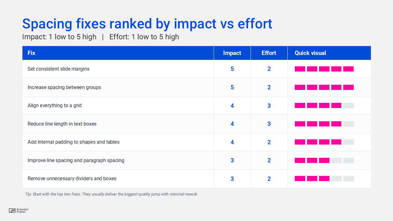
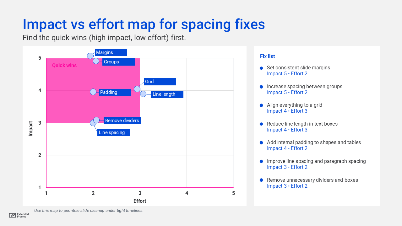
The reason margins and grouping score so high is that they directly affect how people parse structure through proximity and whitespace.
How to do a 10 minute slide spacing audit
Use this before exporting the final PDF.
Step 1: Turn on guides and align tools
- Use guides, grid, and smart alignment.
- Snap objects to a consistent rhythm.
Step 2: Check edge breathing room first
Ask: does anything feel like it is “touching” the slide edges?
If yes, fix margins before touching fonts or colors.
Step 3: Check grouping logic with a blur test
Slightly zoom out or squint. You should see:
- A clear headline area
- One main content group
- Supporting elements clearly separated
If everything blends together, your group spacing is too uniform.
Step 4: Fix line length and line spacing
If you have long paragraphs, reduce the text box width so each line is easier to track. Research-backed readability guidance commonly centers around a limited line length range, which is a helpful reference when you format dense text slides.
Step 5: Normalize padding inside shapes
If callouts and labels have inconsistent internal padding, the slide feels messy even when aligned.
Slide spacing problems and fast fixes
| Problem you see | What it signals | Fast fix |
|---|---|---|
| Everything looks crowded | No margin system | Increase outer margins, then reflow content |
| Slide feels chaotic | No grouping hierarchy | Make within-group spacing smaller than between-group spacing |
| Text feels hard to read | Line length too long or lines too tight | Reduce text width and increase line spacing |
| Titles feel disconnected | Title spacing not tied to content | Pull title closer to its block, push it away from other groups |
| Charts look complicated | Labels and legend compete | Add padding, simplify labels, increase spacing around chart area |
| Slide looks inconsistent | Random spacing values | Adopt a spacing scale like 8-based increments (Material Design) |
Spacing patterns that work across most decks
The “frame and breathe” layout
- Strong margins
- One main content block
- One secondary support area
- Minimal dividers
This works because whitespace does the separating for you.
The “two zone” layout
- Left: headline and key message
- Right: chart or proof
- Clear gutter between zones
Keep the gutter bigger than internal spacing to reinforce separation.
The “stacked rhythm” layout
- Title
- Key insight
- Supporting bullets or data
- Source note
Use increasing spacing as you move down the hierarchy so the slide reads in layers.
A checklist you can keep next to PowerPoint
- Set consistent slide margins across the deck
- Use a spacing scale, avoid random spacing values
- Make within-group spacing smaller than between-group spacing
- Shorten lines for dense text slides
- Increase line spacing and paragraph spacing for readability
- Add internal padding in shapes, tables, and chart containers
- Do a zoomed-out scan to confirm visual hierarchy
Slide spacing is invisible when done well. But it is also the fastest route to slides that look premium, calm, and credible.
If you improve only one thing in your next deck, improve slide spacing. Your typography will look better, our charts will feel clearer, our message will land faster.
And your audience will trust your work more, without ever knowing exactly why.