
Designing slides without a brand is common when a startup is early, a team is mid rebrand, or a client simply has no guidelines yet. The risk is also common: the deck looks inconsistent, decisions feel arbitrary, and every slide becomes a one off. The solution is not to guess a brand. It is to build a small, practical visual system that behaves like a brand until the real one exists.
1. Brandless decks: Designing slides without a brand
When there is no brand, teams often make slide level decisions like random fonts, mismatched icon styles, and inconsistent chart colors. The result is cognitive noise. What is needed is consistency, which improves usability and learnability, because patterns reduce the effort needed to interpret new screens.
Your goal is to create consistency and standards inside the deck, even if the company has no external standards yet.
2. The minimum visual system you need
Defining a visual operating system for slides.
The mini brand stack
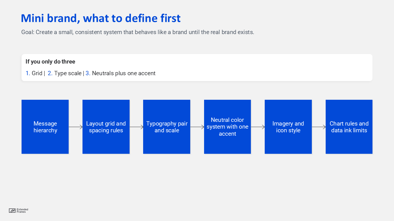
If you only do three things, do these:
- A layout grid with consistent margins
- A type scale with two fonts max
- A neutral palette with one accent color
3. A fast discovery checklist
Use this to avoid designing in a vacuum.
Questions that replace missing brand guidelines
| What you need | Ask this | Output you can lock today |
|---|---|---|
| Audience expectations | Who must trust this deck quickly? | Formality level (conservative vs modern) |
| Use case | Is this sales, investor, internal, training? | Slide density and storytelling style |
| Content reality | More text or more visuals? | Layout templates to prioritize |
| Distribution | Live talk or emailed PDF? | Font sizes, contrast, and spacing |
| Constraints | Any logo, colors, or assets at all? | Starter palette and imagery rules |
If the client has even a single asset like a website, app UI, or product photo, treat that as a seed, not a rulebook.
4. The borrowed structure approach
When brand is missing, borrow structure from what is stable:
- Readability standards
- Accessibility standards
- Presentation mechanics
Decision tree for your default look

This gives you a defensible rationale: you are optimizing for comprehension, not personal taste.
5. Color choices that stay safe
The safest palette model for brandless decks
- Neutrals: background, text, dividers
- One accent: highlights, key numbers, callouts
- One supporting color: optional for secondary emphasis
- Functional colors: success, warning, risk (only if needed)
Accessibility rule you should not skip: For body text, aim for a contrast ratio of at least 4.5 to 1, and for large text at least 3 to 1. If you want a simple workflow, use this WebAim checke while finalizing the theme colors.
Accent discipline
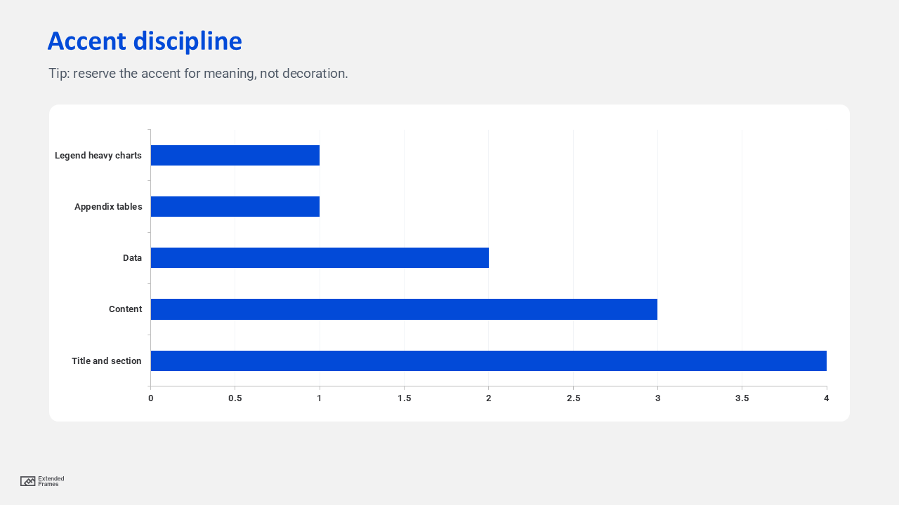
Interpretation: the more data, the more you should reduce decorative color and reserve the accent for meaning.
6. Typography rules that look premium without a brand
Default rule: use two fonts max and define a scale that repeats.
A simple type scale that works in most decks
| Role | Size guidance | Notes |
|---|---|---|
| Title | 36 to 44 | One line when possible |
| Section header | 28 to 34 | Clear break between chapters |
| Body | 18 to 22 | Do not go smaller for projected decks |
| Caption | 14 to 16 | Use for sources and chart notes |
| Big number | 44 to 72 | Use sparingly, one hero metric |
Then define spacing rules such as consistent line spacing and paragraph spacing. This is where “brand feel” often comes from, even more than color.
7. Chart and data styling rules
Use color roles, not random colors.
Chart color roles
| Role | Color rule | Why it works |
|---|---|---|
| Primary series | Accent color | The main story |
| Secondary series | Neutral dark | Comparable but not competing |
| Baseline or target | Neutral light or dashed line | Supports interpretation |
| Negative or risk | Functional color only when needed | Avoids unnecessary alarm |
Keep gridlines light, reduce borders, and label directly when possible. The goal is to reduce visual clutter and increase signal.
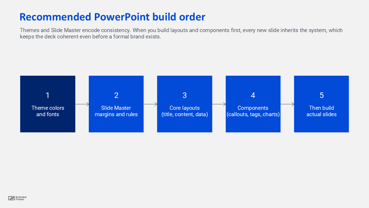
8. Build it correctly in PowerPoint
If you are designing slides without a brand one by one, you will lose consistency. Build the system into the file.
What to use
- Themes: define colors and fonts once, then reuse across layouts
- Slide Master: lock placeholders, logo position, and layout rules globally
Microsoft’s guidance is clear: themes and Slide Master are the foundation for consistent colors, fonts, and layout behavior across a deck.
Recommended PowerPoint build order
9. The “brand ready” handoff
Even if there is no brand, you can hand over assets that make future branding easy.
Deliverables checklist
- One page presentation style guide (mini guide)
- A PowerPoint template with Slide Master layouts
- A chart styling slide with examples
- An icon and imagery rules slide
- A short list of do and do not rules
This mirrors the idea of a style tile: a compact deliverable that communicates the visual direction using fonts, colors, and interface elements, sitting between vague mood boards and fully detailed comps.
If the team is more mature, you can express the system as design tokens, meaning named values for colors, type sizes, and spacing that become a shared source of truth.
10. What to avaoid and fixes
| Mistake | What it looks like | Fix |
|---|---|---|
| Too many fonts | Every slide feels like a new author | Two fonts max, lock in theme fonts |
| Too many colors | Charts and callouts fight each other | One accent, neutrals for the rest |
| No grid | Misaligned boxes and uneven margins | Set margins and snap rules in master |
| Over designed slides | Decorations distract from message | Reduce shapes, increase whitespace |
| Inaccessible contrast | Text disappears on projectors | Check contrast ratios before final |
FAQs
How to handle slide design without brand guidelines?
Treat it like building a mini system: define a grid, a type scale, and a neutral palette with one accent. Then lock it into Themes and Slide Master so every slide inherits the rules.
What is the fastest way to keep an unbranded deck consistent?
Use Slide Master layouts and theme based colors and fonts, and limit choices. Fewer decisions per slide creates a cleaner look and reduces drift.
What contrast should I use for readable slides?
A solid baseline is 4.5 to 1 for normal text and 3 to 1 for large text, aligned with WCAG guidance.
Are style tiles useful for presentations?
Yes. A style tile style deliverable gives stakeholders a fast way to align on visual direction without forcing you to redesign whole slide comps repeatedly.
Designing slides without a brand does not mean designing without rules. It means your rules come from clarity, accessibility, and consistency first, and aesthetics second. If you build a mini visual system, implement it in Slide Master, and document it as a one page guide, your deck will look intentional today and remain easy to rebrand tomorrow.