
If your timeline slide needs a long explanation, it’s the wrong slide. This guide shows you how to pick the right timeline model for your message, design it fast, and make it easy to read, for execs, clients, and teams alike.
Grab our Free Timeline Template (PPTX) a clean, editable pack with 12 proven styles
How to know you need a timeline
Use a timeline slide when your audience must understand sequence, duration, or hand-offs at a glance, for decisions like go/no-go, staffing, or date moves. If the message is “what happens when” (and why it matters), a timeline beats bullets every time. When schedule risk matters, pair your timeline with critical path context so decision-makers see what delays the finish date.
Choosing the right timeline model
Pick the model that matches your decision. Use this as a quick chooser; if you need two views, keep each one simple.
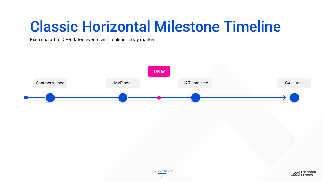
1. Classic Horizontal Milestone Timeline
What it shows
A single time axis with dated markers for 5–9 pivotal events (e.g., Beta, UAT, Launch). It communicates sequence, not task duration.
When to use
Exec readouts, kickoffs, roadshows, any situation where the decision hinges on “what happens when” at a glance (not resourcing).
How to build (2–3 min)
- Draw a left to right axis and add evenly spaced tick marks.
- Place short, noun-verb labels above/ below ticks.
- Add a bold Today marker and optionally shade the current quarter.
Do/ Don’t
- Do: Keep labels ≤5 words; use one date format.
- Don’t: Stack paragraphs under each dot, move details to notes or the next slide.
Example
Jan “Contract signed” > Apr “MVP beta” > Aug “UAT complete” > Oct “GA launch”.
Accessibility tip
Ensure milestone dots and text meet 4.5:1 contrast; add alt text like “Four milestones from Jan–Oct with Today at mid-year.”
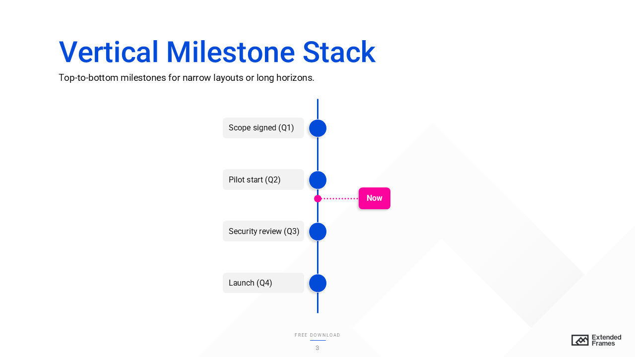
2. Vertical Milestone Stack
What it shows
A top-to-bottom sequence of dated events (helpful when the horizon is long or widescreen space is tight).
When to use
Status docs, mobile-first pages, or narrow layouts where vertical scanning beats horizontal scrolling.
How to build (2–3 min)
- Center a vertical axis; add evenly spaced markers with dates on the left, labels on the right.
- Add a Now ribbon to orient readers.
Do/ Don’t
- Do: Keep spacing consistent so distance suggests time.
- Don’t: Mix date formats or place some labels left and others right (slows scanning).
Example
Q1: “Scope signed” > Q2: “Pilot start” > Q3: “Security review” > Q4: “North America launch.”
Accessibility tip
Use bullet-like markers with labels; keep font ≥16 px and contrast AA or better.
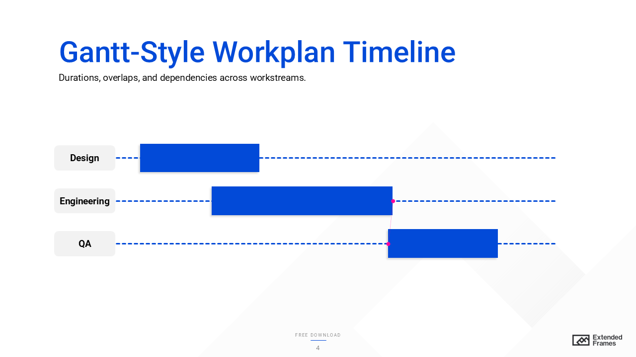
3. Gantt-Style Workplan Timeline
What it shows
Durations, overlaps, and dependencies across tasks or workstreams (rows) on one time axis, ideal for spotting bottlenecks and the critical path that determines the finish date.
When to use
Resourcing, risk reviews, and cross-functional planning where “who does what, when” changes the end date.
How to build (5 min)
- Create rows per workstream (Design, Eng, QA).
- Draw horizontal bars for start to finish; keep bar height uniform.
- Show only major dependencies (small arrows or IDs) and highlight the critical path.
Do/ Don’t
- Do: Use a single scale (all weeks or all months).
- Don’t: Draw spaghetti dependency lines, move heavy details to an appendix.
Example
Design (Apr 1–15) > Eng (Apr 10–May 25; depends on Design) > QA (May 20–Jun 10) > Launch (Jun 15).
Accessibility tip
Indicate critical bars by outline weight/ pattern, not just color; add alt text like “Three overlapping bars; QA depends on Eng; critical chain outlined.”
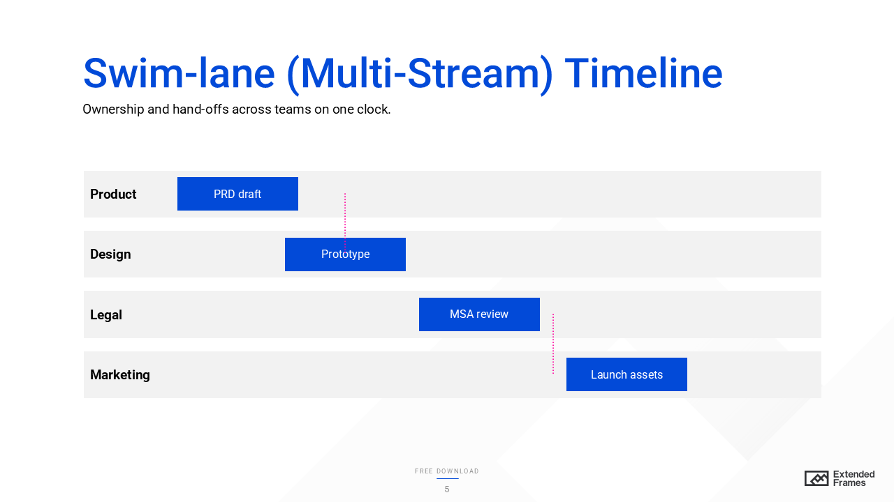
4. Swim-lane (Multi-Stream) Timeline
What it shows
Ownership and hand-offs across lanes (Product, Design, Legal, Marketing) on a shared timeline, great for coordination risk.
When to use
Cross-functional programs where missing hand-offs cause delays more than individual task slippage.
How to build (4 min)
- Draw horizontal lanes with a shared time axis.
- Use event chips or mini-bars inside each lane at the right time.
- Keep hand-off arrows thin and under ~6 per slide.
Do/ Don’t
- Do: Start labels with verbs (“Draft terms,” “Submit brief”).
- Don’t: Mix scales across lanes (e.g., weeks in one, quarters in another).
Example
Legal: “Draft MSA” > Product: “Spec v1” > Design: “Prototype” > Marketing: “Launch assets”.
Accessibility tip
Lane headers need strong contrast; pair icon + text for status (not color alone).
5. Phase-Gate (Stage-Gate) Timeline
What it shows
Work grouped into phases (Concept, Build, Test, Launch) separated by gates with explicit decision criteria, a governance view.
When to use
Medical/ finance/ hardware, or any initiative with required approvals and compliance checks.
How to build (5 min)
- Divide the slide into wide phase bands and narrow gate columns.
- List 3–5 outputs per phase (bullets/ chips).
- In each gate, show go/hold criteria (“Perf ≥ X, risk ≤ Y, budget OK”).
Do/ Don’t
- Do: Use check/hold icons and labels.
- Don’t: Hide criteria, leaders decide faster when terms are visible.
Example
Concept (Mar) > Gate 1: business case > Build (Apr–Jun) > Gate 2: security review > Test (Jul) > Launch (Aug).
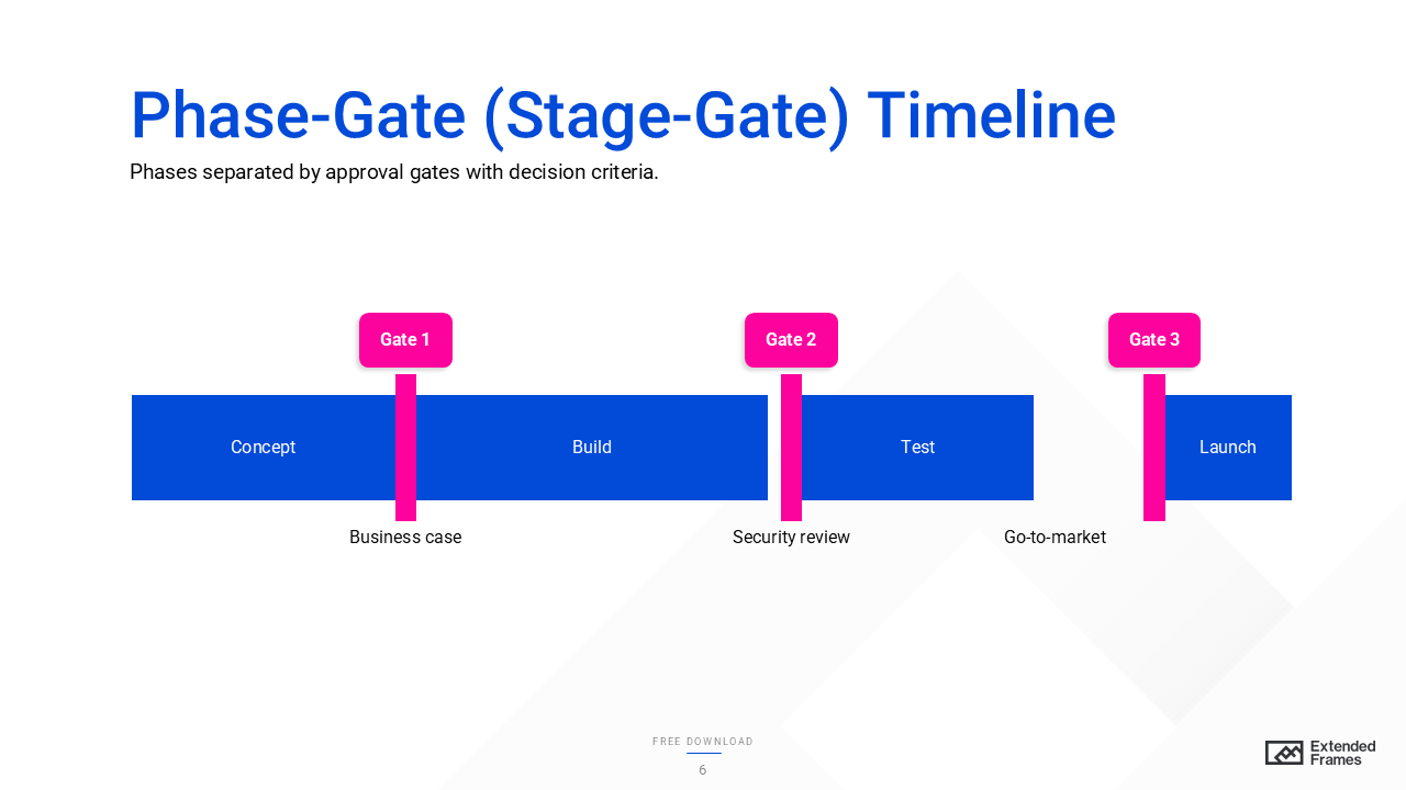
Accessibility tip
Use icon and label (not color only) for gate outcomes; ensure AA contrast.
6. Strategic Roadmap Timeline
What it shows
How themes (e.g., “Platform,” “Market,” “Operations”) map to time using initiative blocks, alignment over precision.
When to use
Portfolio/ OKR reviews; quarterly/ annual planning focused on how work ladders to strategy.
How to build (4 min)
- Create 3–5 theme bands with a light quarterly grid.
- Place labeled blocks sized to rough duration.
- Add impact markers (e.g., “PCI ready,” “EMEA launch”).
Do/ Don’t
- Do: Write blocks as verb and object (“Automate invoicing”).
- Don’t: Stuff tasks into blocks; link out to the backlog.
Example
Platform: “API v2,” “Observability uplift.” Market: “Mid-market playbook,” “EMEA partners.”
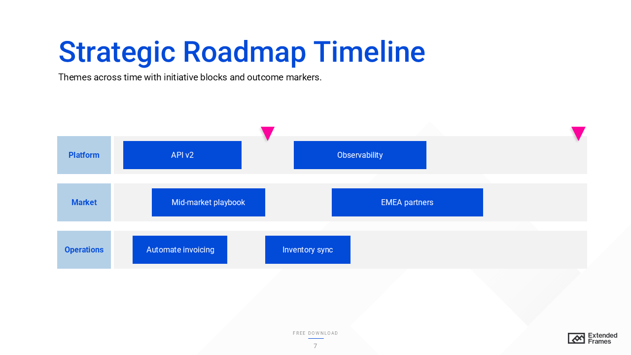
Accessibility tip
Keep color palette restrained; contrast for block labels ≥4.5:1. W3C
7. Macro–Micro (Zoomed) Timeline
What it shows
Two synchronized views: a multi-year macro bar and a zoomed 90-day micro strip, context plus near-term actions.
When to use
Board/leadership updates that need big picture + next steps without slide flipping.
How to build (5 min)
- Top: long-range bar with phases/ quarters.
- Highlight a focus window (e.g., Next 90 days).
- Bottom: show 5–7 near-term milestones/ mini-bars with actual dates.
Do/ Don’t
- Do: Mirror labels and date formats across both views.
- Don’t: Over-detail the macro; keep it coarse by design.
Example
Macro 2025–26; micro (Q1 2025): “Contracts,” “Pilot kickoff,” “UAT,” “GA.”
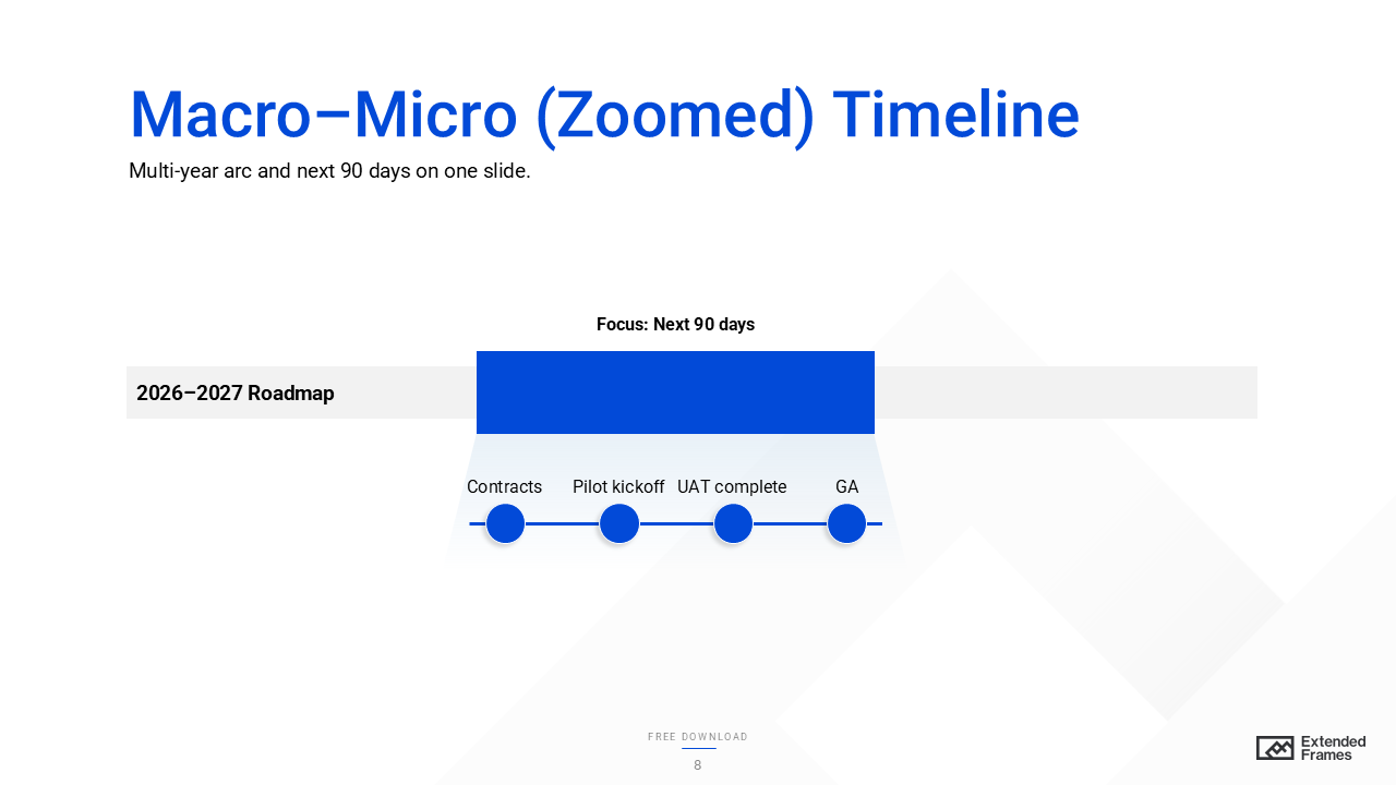
Accessibility tip
Make the window frame high-contrast; add alt text “Two-year bar with a framed Q1; bottom strip details Q1 milestones.”
8. Rolling-Wave Timeline
What it shows
High-fidelity near-term plan and lower-fidelity future plan that gets refined as you approach it, aligns planning rigor to certainty.
When to use
Uncertain or evolving programs where detailed planning beyond a few months causes rework.
How to build (4 min)
- Split the axis into Detail horizon (e.g., 0–90 days) and Planning horizon (90–270 days).
- Use precise tasks in the detail zone; use coarser phase blocks later.
- Add a note for the next re-plan date.
Do/ Don’t
- Do: Signal confidence with visual fidelity (solid now, lighter later).
- Don’t: Promise false precision in distant quarters.
Example
Q1 detailed sprints; Q2–Q3 high-level themes; re-plan at end of Q1.
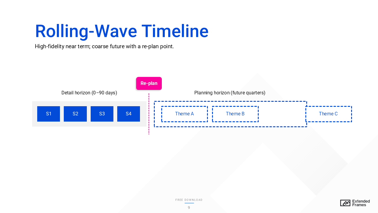
Accessibility tip
Use outline style (solid vs dashed) and labels to show confidence (not only color).
9. Calendar-Grid Timeline
What it shows
A familiar month/ quarter grid with activities placed into actual calendar cells, great for launches or campaigns.
When to use
Channel plans, content calendars, event schedules, when the day/ week matters.
How to build (3–4 min)
- Draw a 3×4 quarter grid (or a monthly matrix).
- Place events in cells; use short labels; avoid stacking more than 2–3 items per cell.
- Shade the current month band.
Do/ Don’t
- Do: Keep a legend for recurring events.
- Don’t: Mix week numbers and month names on the same axis (pick one).
Example
Apr: “Webinar,” May: “Beta signups,” Jun: “Version 1.1,” Jul: “Partner summit.”
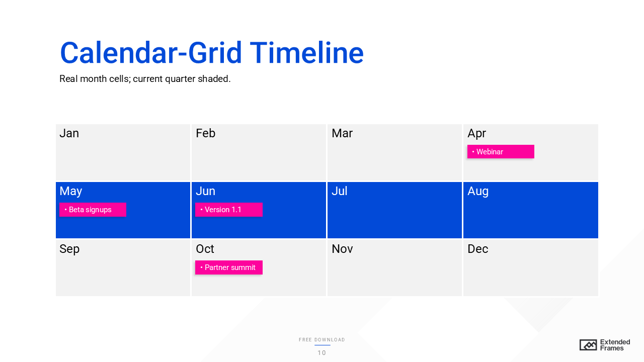
Accessibility tip
Ensure cell labels are ≥16 px and contrast AA; include alt text “Quarterly grid with four releases and current month shaded.”
10. Release-Train/ Increment Timeline
What it shows
A row of equal-length cadence blocks (Sprints or PIs) with features per block; emphasizes stable rhythm and alignment across teams (core to SAFe’s Agile Release Train).
When to use
Agile program updates, PI planning recaps, product roadmaps.
How to build (4 min)
- Draw equal blocks labeled S1, S2… or PI-1, PI-2 with dates.
- Add 3–5 feature tags per block; grey/ lighten far-future blocks to show lower confidence.
- Outline the current block.
Do/ Don’t
- Do: Keep future items low-fidelity; avoid over-committing.
- Don’t: List tasks, focus on shippable outcomes.
Example
PI-1 (Jan–Feb): “Auth revamp,” “Usage dashboards” | PI-2 (Mar–Apr): “Billing proration,” “Alerts v2”.
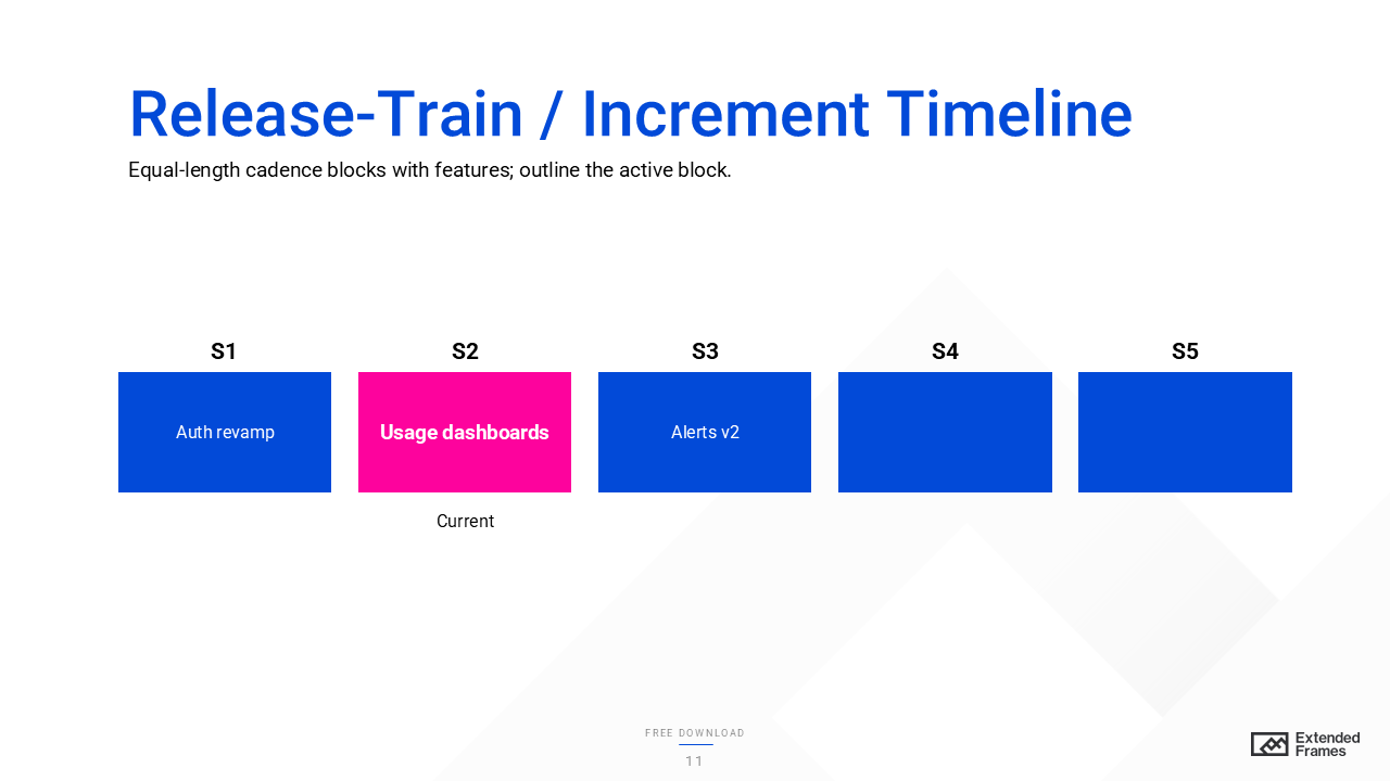
Accessibility tip
Use outline weight and a “Current” label (not color only) to mark the active block.
11. S-Curve Adoption Timeline
What it shows
A cumulative adoption curve (S-shaped: slow start, rapid growth, plateau) aligned to milestones that drive uptake (e.g., pricing change, feature release, market entry). Rooted in diffusion-of-innovations research (Rogers).
When to use
Product/ feature launches and change programs where the question is “when does value land?”
How to build (5 min)
- Plot a line chart for cumulative adoption (% or users) over time.
- Add milestone markers underneath (e.g., “Beta,” “GA,” “Pricing revamp”).
- Add target line at desired adoption; annotate slope changes (what caused the jump).
Do/ Don’t
- Do: Use a line chart for trends; label inflection points with brief causes.
- Don’t: Use bars to show a trend line, lines are better for time-series.
Example
Month 1–2 (Beta ~5%), Month 3 (GA – 18%), Month 5 (Pricing change – 42%), Month 8 (Plateau – 68%).
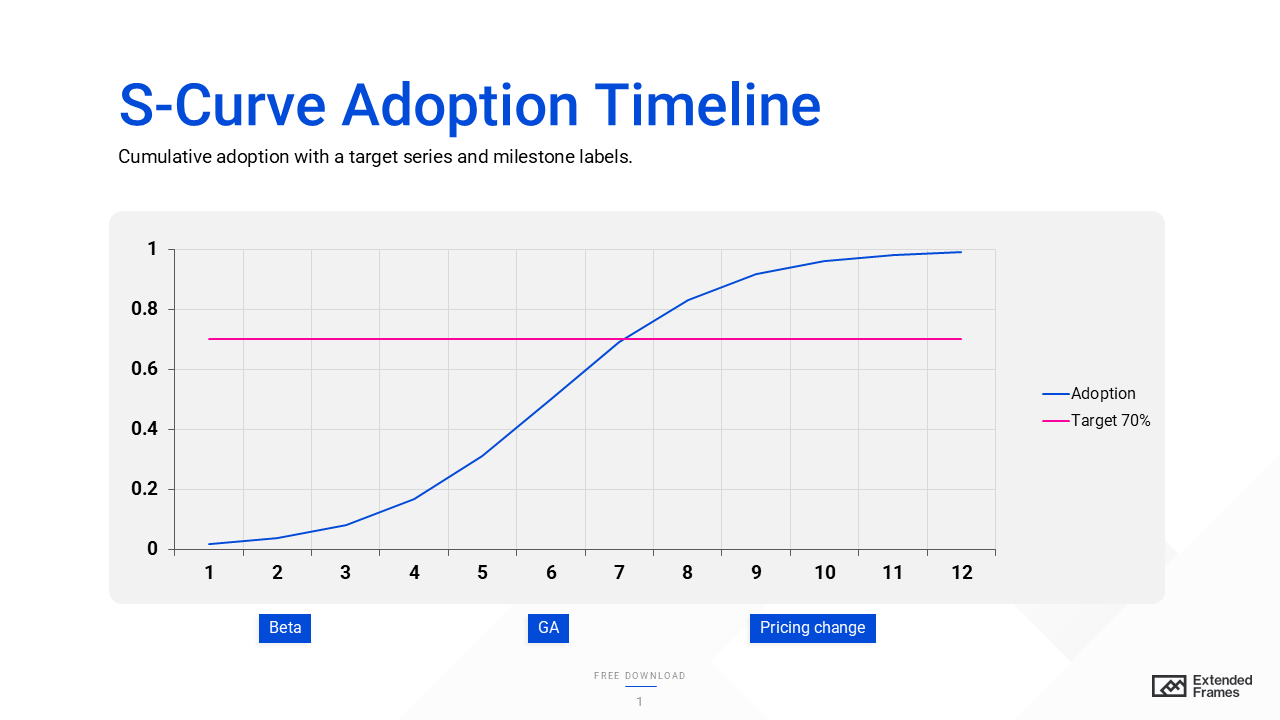
Accessibility tip
Ensure the trend line and labels meet AA contrast; add alt text “Cumulative adoption curve with inflection at Month 3 and Month 5; target line at 70%.”
12. Outcome–Metric Overlay Timeline
What it shows
A single slide that links actions to outcomes: a KPI (Key Performance Indicator) trend line (e.g., NPS, activation rate, defect rate) with milestones annotated on the same time axis. You can see which events moved the metric and whether you’re tracking to a target line.
When to use
- Exec reviews that ask “what worked?” or “why did the trend change?”
- Post-launch or post-campaign analysis tying releases/ policy changes to KPI shifts
- Change-management and enablement updates that must prove impact, not just activity
How to build (5 minutes)
- Add a line chart for the KPI across your period (months/ quarters).
- Add a target series (goal band or dashed line) for context.
- Draw a simple timeline axis below the chart; place milestone markers (Beta, GA, pricing change, onboarding revamp).
- Add thin dotted connectors from each milestone up to the point on the chart where the effect appears (often with a lag).
- Caption the cause > effect briefly (e.g., “Self-serve onboarding cut setup time > activation +9 pts”).
Do/ Don’t
- Do: Keep to one primary KPI per slide; if you need two, use either a secondary axis or a second slide.
- Do: Annotate inflection points (slope changes) with concise labels.
- Don’t: Use bars for the trend, lines are faster to read for time-series.
- Don’t: Over-claim causality, note where correlations are suggestive vs. proven.
Example
KPI (NPS) rises from 45 > 68 over 12 months. Inflections at Month 5 (GA), Month 8 (Onboarding revamp), Month 9 (Pricing change). Target 62 line shows when you cross goal and whether you sustain it.
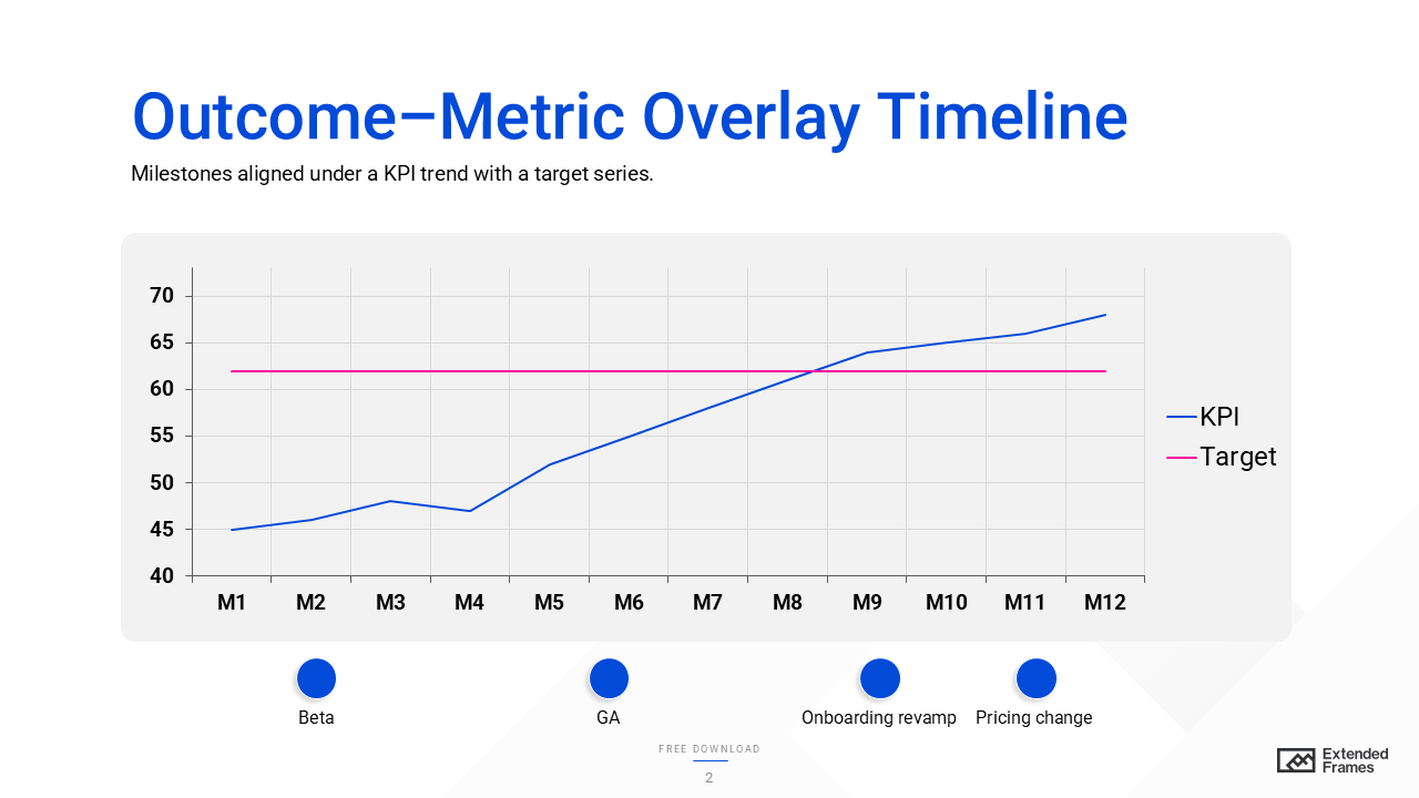
Accessibility tip
Use AA contrast for the line and labels; pair shape and text for milestones (not color alone). Add alt text like: “KPI line with target at 62; four milestones; slope increases after GA and onboarding revamp.”
Design rules that keep timelines readable
1. Show hierarchy, not decoration.
Use a strong axis, consistent spacing, and short labels. Keep the “big story” (phases or quarters) visually larger than task details.
2. Make the data type match the chart.
If you need to show trend over time (e.g., adoption alongside milestones), use a line chart, not bars. For discrete comparisons (e.g., tasks by owner), bars remain the quickest to read due to preattentive length comparison.
3. Mark “Today” and critical items.
A vertical “Today” rule and subtle highlight on the critical path turns conversations from arguing dates to managing risk.
4. Cap the density.
If you can’t keep labels legible at 100% zoom, split across two slides (e.g., exec summary and detail).
5. Label dependencies simply.
Prefer small arrows or ID tags (A→B) over spaghetti lines. If there are many, move dependency details to the notes or appendix.
Accessibility essentials
- Contrast. Ensure body text meets WCAG 2.1 contrast minimums: 4.5:1 for normal text (AA), 3:1 for large text and UI graphics. If you aim for AAA in dense charts, target 7:1. W3C+2W3C+2
- Alt text. Provide 1–2 sentences for images and charts (e.g., “Q3 launch slipped two weeks; downstream UAT moved to Oct 15.”).
- Captions/transcripts. If you embed explainer video snippets, include captions or provide a short transcript link. W3C
Build-it-fast workflow (PowerPoint/ Google Slides)
- Pick the model (milestone, Gantt, swim-lane).
- Rough it with shapes and text, don’t style yet.
- Add Today and gates/ risks only after dates are stable.
- Style last: grid, spacing, and a restrained palette; check contrast.
- Export variants: one summary slide and one detail slide (or a PDF handout).
If you’re building in PowerPoint, SmartArt and timeline tools can speed up the first draft; then convert to shapes so you can refine spacing and hierarchy.
Common mistakes to avoid
- Over-annotating: If every milestone has a paragraph, it’s a memo, split into summary + detail.
- Mixed time scales: Quarters and weeks on one axis confuse people. Pick one.
- Chart mismatch: Plotting a trend with bars (or too many pie charts). Use line for time-series; bars for discrete comparisons.
- No risk context: A timeline without critical path or dependency hints invites false confidence.
Quick chooser table
| Your goal | Use this timeline | Why it works |
| Exec snapshot of key dates | Milestone | Scannable “what happens when.” |
| Staffing or overlap risk | Gantt | Shows durations, overlaps, and blockers. |
| Governance decision | Phase-gate | Gates and criteria are obvious. |
| Cross-functional hand-offs | Swim-lane | One clock, clear ownership. |
| Agile release update | Release train | Fixed cadence blocks; easy status. |
| Strategy alignment | Roadmap | Connects themes to time-bound work. |
Need a done-for-you timeline pack (PowerPoint and Google Slides) aligned to your roadmap?
Grab our free Timeline Template (PPTX) a clean, editable pack with 12 proven styles (milestones, Gantt, swim-lane, roadmap, release train, S-curve, and more). Every slide uses simple shapes and an editable chart, so you can swap dates, add gates, and brand it in minutes. Download now and build clear, executive-ready timelines fast.