Hybrid-First Architecture: Designing Decks for the Asynchronous Viewer
Asynchronous presentation design is no longer a niche skill. In hybrid work, the same deck may be shown in a room, shared after the meeting, opened from a QR code, downloaded as a PDF, or viewed on LinkedIn by someone who never heard the presenter speak. That shift matters because hybrid work and asynchronous collaboration are now standard parts of how teams communicate, and major workplace research from Microsoft and Atlassian reflects that reality.
The problem is that most slide decks are still built for the room, not for the reader. They depend on the presenter’s voice to explain the point, decode the chart, add the missing context, and connect one slide to the next. Once the meeting ends, the same deck often becomes thin, confusing, and easy to ignore. Duarte’s distinction between a live presentation and a “Slidedoc” is useful here: some communications need a visual deck for delivery, while others need a document-like presentation that can stand on its own without a presenter.
That is where hybrid-first architecture comes in, a practical design framework: build presentation systems that still work when the presenter disappears. The deck should be clear in the room, but also self-explanatory when opened later on a phone, in a browser, inside a PDF, or through a shared link.
What is Hybrid-First Architecture
Hybrid-first architecture means designing for two modes at once:
- the live viewer, who gets spoken explanation in real time
- the asynchronous viewer, who gets only what the file itself provides
As Atlassian defines it, asynchronous communication is communication that does not happen in real time. Microsoft also explicitly encourages asynchronous collaboration as part of flexible work. When that is your communication environment, a deck is no longer just a presentation aid. It is also a portable knowledge object.
That shift changes the design brief. A deck is no longer successful just because it looks polished on a projector. It is successful if someone can open slide 7 on their phone after the meeting and still understand the point, the evidence, and the next step. That requirement pushes presentation design closer to information design, documentation, and accessibility.
Why so many decks fail after the meeting
Most decks fail asynchronously for five predictable reasons.
First, they are built around spoken narration, not written clarity. A title such as “Market Update” may work when a presenter is talking over it, but it does very little for an asynchronous reader.
Second, they use charts as visuals instead of arguments. A chart without a takeaway caption forces the reader to do interpretive work that the presenter would normally do aloud.
Third, they overload slides with text in ways that are still not readable on small screens. W3C notes that mobile accessibility is covered by existing accessibility standards, and MSU Denver’s guidance for multimedia presentations specifically warns against dense material because learners increasingly access presentations on smartphones.
Fourth, they ignore accessibility and reading order. Microsoft’s PowerPoint accessibility guidance explains that screen readers read slide objects in reading order, which can differ from how the slide appears visually unless the order is intentionally set and checked. Adobe makes the same point for PDFs, where reading order and figure tagging affect whether a document makes sense to assistive technologies.
Fifth, they misuse QR codes. Accessibility guidance from Nottinghamshire County Council says QR codes should not be used on their own, should always have a short URL alternative, and should not be relied on in online content such as websites, emails, videos, or social media posts. GOV.UK Notify similarly requires an alternative, readable path and advises not to place more than one QR code per page.
Live-only deck vs hybrid-first deck
| Element | Live-only deck | Hybrid-first deck |
|---|---|---|
| Slide titles | Topic labels | takeaway headlines |
| Charts | visual support | visual plus explicit insight |
| Narrative flow | speaker-dependent | file-dependent |
| Links | optional | essential and obvious |
| QR code use | often decorative | only when useful, always with short URL |
| Mobile readability | secondary | mandatory |
| Accessibility | often ignored | built in from the start |
| After-meeting value | low | high |
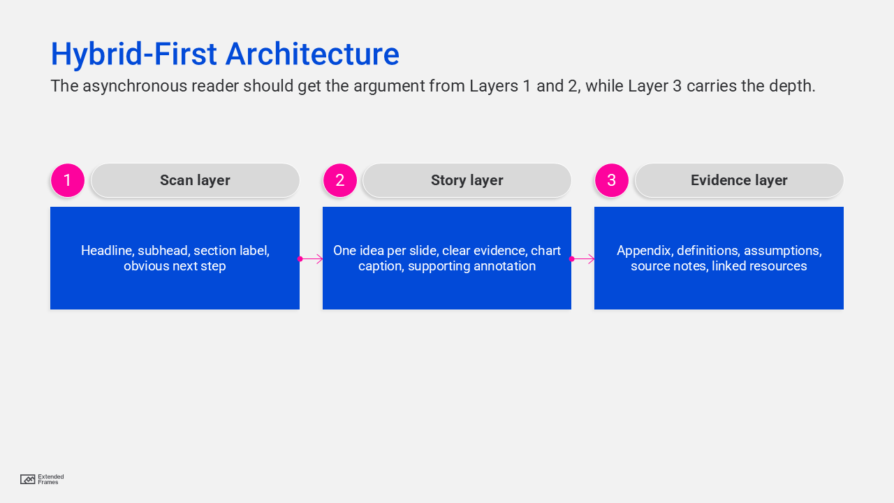
The hybrid-first architecture
Where the context should live
Practical design heuristic, not external benchmark data.
| Viewing context | Context that should live on the slide |
|---|---|
| Live meeting room | 40% |
| Shared PDF after meeting | 85% |
| LinkedIn document post | 90% |
| QR-linked follow-up deck | 85% |
The point of the chart is simple: the farther the deck gets from the presenter, the more meaning must be embedded directly into the slides.
The seven principles of asynchronous presentation design
1. Write headlines that carry meaning
A strong hybrid-first slide starts with a headline that states the point, not the topic. “Client retention rose after onboarding redesign” is stronger than “Retention.” “Three risks are blocking rollout” is stronger than “Risks.”
This is the single easiest way to make a deck self-explanatory. If someone skims only the headlines, they should still understand the argument. That is the difference between a live-only deck and a readable one.
2. Caption every chart with the takeaway
Google’s accessibility guidance for complex images says they often need both short alt text and a longer description in the surrounding document text, and that graphs should be paired with a data table or descriptive explanation. Google’s SEO guidance also says images work best when placed near relevant text that explains their meaning in context.
For presentations, that means every chart should have:
- a takeaway headline
- a short interpretive caption
- labels or callouts that direct attention to the important part
Do not make the reader hunt for the point.
3. Design slides in chunks, not walls
Guidance from MSU Denver recommends chunking long presentations into smaller segments for synchronous and asynchronous viewing, avoiding long, dense sections, and being mindful of smartphone access. Their guidance also notes that attention drops quickly after 10 to 15 minutes and that overlong slides often signal overloaded content.
In business presentations, that translates well:
- one idea per slide
- one action per section
- one reason to advance
Chunking is not dumbing down. It is sequencing.
4. Make the visual hierarchy do the explaining
When the presenter is absent, hierarchy becomes narration. The viewer needs to know instantly what to read first, what matters most, and what is secondary. Microsoft’s accessibility guidance recommends logical reading order, while W3C’s mobile accessibility guidance reinforces that accessibility standards apply to mobile experiences too.
That means:
- one dominant message per slide
- fewer competing focal points
- generous spacing
- clear type contrast
- labels that explain, not decorat
5. Treat QR codes as bridges, not as crutches
QR codes can be useful in a room because they connect a static moment to a richer digital follow-up. But they are not a substitute for usable links. Accessibility guidance says not to rely on QR codes alone, to provide short URLs, and to avoid using QR codes in online content such as social posts, videos, or digital documents where clickable links are better. GOV.UK Notify also recommends only one QR code per page.
So the rule is simple:
- During the meeting: a QR code can point to the leave-behind, appendix, booking page, case study, or full report
- After the meeting or on LinkedIn: use a direct clickable link and short URL instead of making users scan
This one change removes friction immediately.
6. Build accessibility into the deck, not onto it
Microsoft recommends using Accessibility Checker and setting reading order in PowerPoint. Adobe recommends checking PDF reading order and adding alternate text to figures that matter. Google recommends short, contextual alt text for images, and longer explanations in body text for complex graphics such as flowcharts or charts.
For slide decks, that means:
- set reading order intentionally
- add alt text to meaningful visuals
- avoid putting meaning in color alone
- make tables understandable
- ensure exported PDFs preserve logical order
Accessibility is not a compliance box here. It is part of making the deck understandable without you.
7. Publish like the deck is public, because it probably is
Google now states clearly that it can index the content of most text-based files and several encoded formats, including PDFs, PowerPoint files, and Word documents. Google also recommends people-first content and descriptive, contextual image text.
That has an important implication: a deck shared publicly after a meeting is not just a file. It is a searchable content asset.
So when you publish a deck publicly:
- assume it can be found
- assume it can be forwarded
- assume it can be viewed out of context
- assume it should still represent your thinking well
For SEO, the smartest model is often an HTML article plus downloadable deck, not a PDF alone. The article gives search engines and readers context; the deck gives them the visual asset.
A structure for a hybrid-first deck
Here is a structure that works well for presentations that must survive after the meeting.
| Slide type | Purpose for the live viewer | Purpose for the async viewer |
|---|---|---|
| Title slide | sets frame | clarifies topic immediately |
| Executive summary | previews the talk | acts as standalone abstract |
| Problem slide | creates tension | explains why the issue matters |
| Insight slide | advances argument | gives the main takeaway clearly |
| Evidence slide | supports verbally | supports independently |
| Recommendation slide | enables discussion | makes the decision obvious |
| Timeline or process slide | guides presentation | shows sequence without narration |
| Risks/assumptions slide | prompts questions | adds transparency |
| Next steps slide | closes the meeting | gives action path |
| Appendix | supports Q&A | serves deeper readers later |
This is where hybrid-first architecture becomes powerful, by not forcing every slide to become text heavy. but simply making each slide complete enough to do its job without your voice.
What this means for LinkedIn and post-meeting sharing
LinkedIn document posts, email attachments, and QR-linked follow-ups all have one thing in common: they are reader-controlled experiences. The viewer chooses pace, order, depth, and whether to continue. That is much closer to reading than presenting.
So the winning deck on LinkedIn is usually not the most cinematic deck. It is the clearest one:
- headlines that tell the story
- slides that survive skimming
- charts with explicit takeaways
- strong section pacing
- mobile-friendly text sizing
- visible next-step links
That is not a compromise. It is better communication.
A strong modern deck should perform in the room, but it should also survive the handoff. It should make sense when opened from a QR code, shared on LinkedIn, forwarded in email, or discovered later in search. Microsoft, Atlassian, Google, Adobe, W3C, and accessibility-focused public guidance all point in the same direction: communication now travels across modes, devices, and contexts, so clarity, accessibility, and self-contained structure matter more than ever.
The best deck is no longer the one that looked great on the screen. It is the one that still works after the meeting.