
Pure Black on White Background: Why It Isn’t Always Best
For years, designers have defaulted to black text on a white background because it feels obvious, clean, and safe. And to be fair, there is a reason that pattern is everywhere: pure black on pure white creates the highest possible WCAG contrast ratio, 21:1, and high contrast is a core part of accessible design. WCAG 2.2 sets the minimum contrast requirement for normal text at 4.5:1 and the enhanced requirement at 7:1. So from a strict compliance standpoint, black on white is undeniably strong.
But “maximum contrast” is not the same thing as “best reading experience in every situation.” That is where the conversation gets more interesting. Readability research consistently favors dark text on a light background over the reverse combination, yet modern accessibility and typography guidance also shows that you do not need absolute maximum contrast to remain highly readable. In other words: light mode is often the right direction, but pure black on pure white is not always the best finish.
What the research actually says
A large body of reading research supports positive polarity displays, meaning dark text on a light background. Studies cited in PubMed and Applied Ergonomics found better reading and proofreading performance with dark text on light backgrounds than with light text on dark backgrounds, and one explanation is that brighter backgrounds reduce pupil size and improve visual acuity for reading fine detail.
That said, those findings do not automatically prove that #000000 on #FFFFFF is always the best possible pairing. Accessibility standards focus on minimum usable contrast, not on declaring that maximum contrast is always the most comfortable. WCAG gives thresholds, and APCA goes further by recommending contrast by use case rather than treating every text scenario the same. APCA’s guidance prefers around Lc 90 for fluent body text and treats Lc 75 as a practical minimum for many body-text scenarios. That framework leaves room for softer near-black text that is still very readable.
There is also guidance from dyslexia and public-service accessibility sources that pushes against bright white backgrounds for some readers. The British Dyslexia Association recommends dark text on a light but not white background, and notes that some people experience visual stress and glare from black print on a bright white background. The NHS design system follows the same logic and uses a tinted page background partly to reduce glare.
So the balanced takeaway is this: dark text on a light background is usually the safest reading pattern, but pure black on pure white can be harsher than necessary for long-form digital reading, especially for some users.
How much contrast do you actually need?
Using the WCAG luminance formula, here is what common dark text colors look like on a white background. The point is not to make contrast low. The point is to show how much room you still have before readability becomes a problem. WCAG AA for normal text is 4.5:1, and AAA is 7:1.
| Text color | Example use | Contrast on white | Accessibility note |
|---|---|---|---|
#000000 |
Pure black | 21.0:1 | Maximum possible contrast |
#0B0C0C |
GOV-style near-black | 19.6:1 | Extremely strong |
#1F2328 |
GitHub-like near-black | 15.8:1 | Extremely strong |
#333333 |
Common body-text gray | 12.6:1 | Well above AAA |
#595959 |
Softer body text | 7.0:1 | Meets AAA |
#767676 |
Muted text | 4.54:1 | Barely passes AA |
Quick visual spectrum
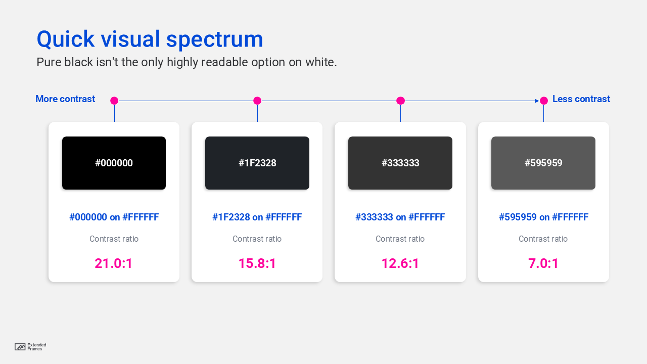
That chart is why many design systems avoid pure black for everyday UI text. GitHub Primer’s light theme foreground token is #1f2328, Carbon uses gray ranges rather than hard black for light-theme text, and Material’s older guidance used black at 87% opacity on light backgrounds, which effectively renders as a dark gray rather than full #000000.
Why pure black might not be the best color on a white background
1. Long-form reading on screens
For dense reading on laptops, tablets, and phones, maximum contrast can feel harsher than necessary over time. That does not make it inaccessible; it just means it may not be the most comfortable for sustained reading. Accessibility guidance from APCA, the NHS, and dyslexia-related guidance all point toward the same practical idea: keep contrast strong, but do not assume the most extreme combination is always the best experience.
2. Audiences with visual stress, dyslexia, or light sensitivity
This is one of the clearest situations where pure black on bright white can become a problem. The British Dyslexia Association explicitly recommends dark text on a light, non-white background, and notes that glare from black text on bright white can make words seem unclear or tiring for some readers.
3. Interfaces that already feel visually aggressive
If your layout has dense copy, tight spacing, strong borders, and lots of hard-edged UI components, pure black text can amplify that feeling. A near-black body color and a slightly softened background often make the interface feel calmer without sacrificing accessibility, as long as you keep contrast well above the required thresholds. This is exactly the kind of flexibility APCA and modern design-token systems support.
4. Brand-led design systems that need nuance
Most mature design systems do not rely on raw #000000 for body text in light mode. They use near-black tokens so typography feels softer, more refined, and more adaptable across components, layers, and themes. That pattern shows up in Material, Carbon, and Primer.
5. Slides that will be shared after the presentation
This is an important presentation-design edge case. During a live presentation, stronger contrast often helps because projectors and room lighting can wash out slides. But if the same deck is later read on a personal screen as a leave-behind, an off-white background or near-black text may create a more comfortable reading experience. That is an inference based on two separate realities in the guidance: presentation content needs strong contrast for rooms and projection, while bright white slides can also make text harder to read in some contexts.
When pure black is still the right choice
It would be sloppy to say “never use pure black.” There are cases where pure black is absolutely reasonable.
| Situation | Why pure black can work |
|---|---|
| Small text that must stay highly legible | Maximum contrast gives you the largest margin of safety |
| High-glare rooms or projected slides | Strong contrast helps fight washout |
| Forms, dashboards, tables, compliance-heavy docs | Precision matters more than softness |
| Monochrome brand marks or print-ready assets | Pure black may be required for reproduction consistency |
| High-contrast or user-customized modes | Users may specifically need the strongest setting |
This is also why official guidance can look mixed. Microsoft’s accessibility advice for PowerPoint emphasizes strong contrast and notes that white-and-black schemes can help many users distinguish text and shapes, while GOV.UK/Home Office guidance still uses black text on white for many services because it easily clears accessibility requirements.
What you should do instead
Use near-black for body text
For most digital reading experiences, a near-black such as #1F2328, #262626, or #333333 is a safer default than full #000000. These still give you excellent contrast on white, often far above AAA.
Consider softening the background, not just the text
If the interface feels glaring, you can keep dark text and move the background from pure white to something like #FAFAF7, #F7F7F7, or another subtle neutral tint. That approach aligns with dyslexia guidance and public-sector accessibility practice that aims to reduce page glare.
Match contrast to content type
Body text needs stronger contrast than giant headlines, thick icons, or decorative elements. That is one of APCA’s most useful ideas: different reading tasks need different contrast levels.
Let users control presentation where possible
WCAG’s visual presentation guidance for blocks of text says users should be able to select foreground and background colors. That matters because “best” is not universal. Some readers genuinely do better with different color combinations.
Test in the real environment
A web article read at arm’s length is not the same as a keynote slide projected in a sunlit boardroom. Microsoft recommends checking colors on the projection screen itself because slides can look different when projected.
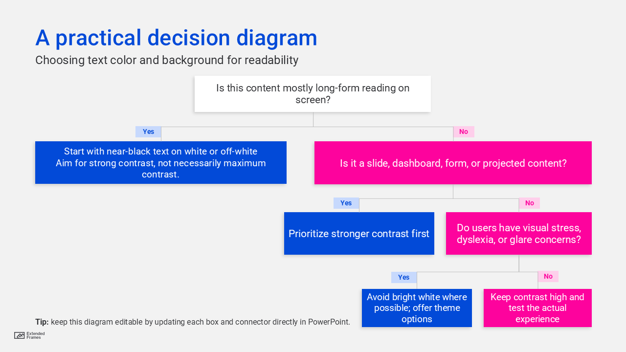
A practical decision diagram
Recommended color pairs
| Use case | Recommended pairing | Why it works |
|---|---|---|
| Web/body text | #1F2328 on #FFFFFF |
Strong, modern, less harsh than pure black |
| Long articles | #333333 on #FAFAF7 |
Comfortable, still highly readable |
| Data-heavy UI | #0B0C0C on #FFFFFF |
Crisp and precise |
| Presentation handouts | #262626 on #F7F7F7 |
Easier on the eyes for reading |
| Live presentation slides | Very dark text on very light background | Holds up better under projection and room light |
Pure black on a white background is not “wrong.” In fact, it is one of the most accessible and familiar combinations in digital design. But if your goal is not just compliance, and also comfort, polish, and sustained readability, then pure black is often more extreme than necessary. For long-form reading, typography-heavy layouts, and audiences sensitive to glare, a near-black text color and, in some cases, a softly tinted background is often the smarter choice. The best strategy is simple: keep contrast high, avoid unnecessary glare, and choose the combination that fits the reading context.