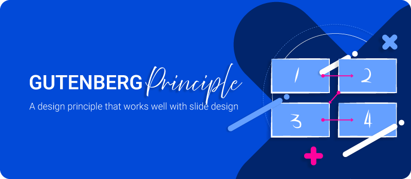
Why Gutenberg Principle in Presentation Design
Good presentation design besides being clean and attractive visuals, it is more about guiding attention. The Gutenberg principle in presentation design helps you do exactly that by giving structure to where people look first, where their eyes travel next, and where your most important message should land. When used well, it can make a slide feel easier to read, easier to understand, and easier to remember.
Many designers know the Gutenberg principle as a layout rule tied to reading flow. It is often credited to newspaper designer Edmund Arnold, who is associated with the modern use of this principle in page composition. The idea is simple: in left to right reading contexts, people tend to enter a layout near the top left and finish near the bottom right, especially when the content is fairly even and text heavy.
That does not mean every page or every slide is read in exactly the same way. Eye tracking research shows scanning behavior changes based on the task, the layout, and whether the content is text led or image led. So the Gutenberg principle is best treated as a practical design guide, not an unbreakable law.
What is the Gutenberg principle?
The Gutenberg principle describes a common reading path across a layout. In left to right reading environments, the eye often starts in the primary optical area at the top left, moves across the page, drops down, and finishes in the terminal area at the bottom right. The remaining two zones, usually called the strong fallow area and weak fallow area, tend to receive less natural attention unless something in those areas creates contrast or emphasis.
Here is the idea in a simple diagram:
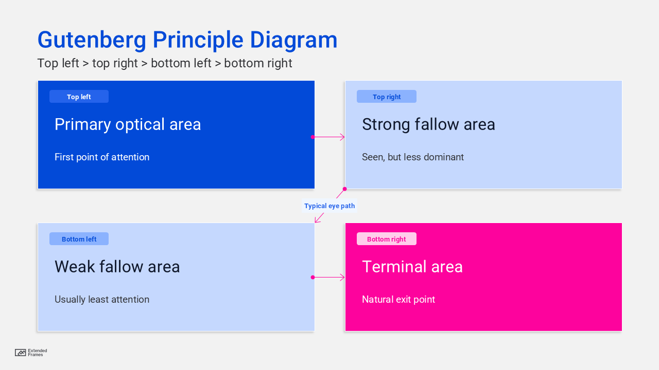
This is crutial because layout is not neutral. Where you place a headline, chart label, key number, call to action, or takeaway sentence changes what the audience notices and in what order. Visual hierarchy is really about arranging elements so people recognize their order of importance right away.
Why Gutenberg principle is important in design
A lot of design problems are because the content does not have a clear path. When everything is equally loud, nothing feels important. The Gutenberg principle helps solve that by giving designers a starting structure for visual hierarchy.
This becomes even more useful when the content is dense. Research on scanning patterns shows that people often pay more attention to the top and left side of a page when text is involved, especially when headings, bullets, and structure are weak. That means a layout that supports natural movement can reduce friction and help people understand faster.
In practical terms, the principle helps designers decide where to place a headline, where to anchor a visual, where to put a key number, and where to end with a strong takeaway. It also works well with other design fundamentals like contrast, spacing, and alignment, which all contribute to visual hierarchy.
Why the Gutenberg principle works so well in presentation design
Slides are usually consumed quickly. Even in a live talk, the audience is balancing speech, text, charts, and motion at the same time. In an asynchronous deck, the slide has to do even more work on its own. That makes structure incredibly important. MIT’s communication guidance for slides notes that a good slide should convey the necessary information concisely, and that the presenter can guide the audience’s eyes through hierarchy, placement, size, color, and movement.
That is where the Gutenberg principle in presentation design becomes useful. It gives you a natural attention path for arranging elements so the slide feels readable before anyone consciously thinks about it. Put the headline or main message where the eye is likely to enter. Put the most persuasive supporting evidence along the path. Let the final action point or key conclusion land where the eye naturally exits.
Presentation research also supports the broader idea behind this. Cognitive load guidance from UC San Diego and the New South Wales education resources shows that cluttered slides overload working memory, while concise text, signaling, and well-integrated visuals help people process information more effectively. In other words, a slide works better when the audience does not have to fight the layout.
How to apply the Gutenberg principle to a slide
A useful way to think about it is not as decoration, but as sequencing. Your slide should answer three questions in a clear order:
- What am I looking at?
- What matters most here?
- What should I remember or do next?
If the slide answers those in the same order the eye moves through the layout, the experience feels smooth. If not, the audience has to work harder than they should.
A simple slide mapping approach
| Slide zone | What to place there | Why it works |
|---|---|---|
| Top left | Slide title or core message | This is often where attention starts |
| Top right | Supporting context, category label, or visual cue | It gets noticed early but is usually secondary |
| Bottom left | Detail, footnote, or small supporting point | This area often gets less natural attention |
| Bottom right | Key takeaway, call to action, or closing proof point | This is the natural exit area |
This table is a practical synthesis of the Gutenberg diagram, common scanning behavior, and slide hierarchy guidance. It works best when the slide is relatively balanced and not overloaded with competing elements.
Presentation design examples
1. Title and data slide
On a results slide, place the message-driven title at the top left: Customer retention improved after onboarding simplification.
Then use the chart as the main supporting evidence across the center or right side. Finish with one short takeaway in the bottom right: Retention rose from 68 percent to 81 percent in 90 days.
This works because the audience sees the claim first, reads the evidence next, and ends on the conclusion you want them to keep. That sequencing mirrors both slide communication best practice and the basic reading flow of the Gutenberg principle.
2. Comparison slide
If you are comparing “before” and “after,” the title still belongs in the entry area, but the eye path should help the audience reach the winning message without confusion. The biggest mistake here is putting equal visual weight on every object. The principle only helps if hierarchy is clear. UCSF’s slide guidance makes the same point: spacing, structure, headers, and type weight all help reinforce hierarchy.
3. Call to action slide
A proposal slide often needs a strong final landing point. That makes the terminal area especially useful. A short decision prompt, next step, or recommendation placed toward the bottom right can feel naturally conclusive because it matches the exit point of the layout.
Where attention usually feels strongest
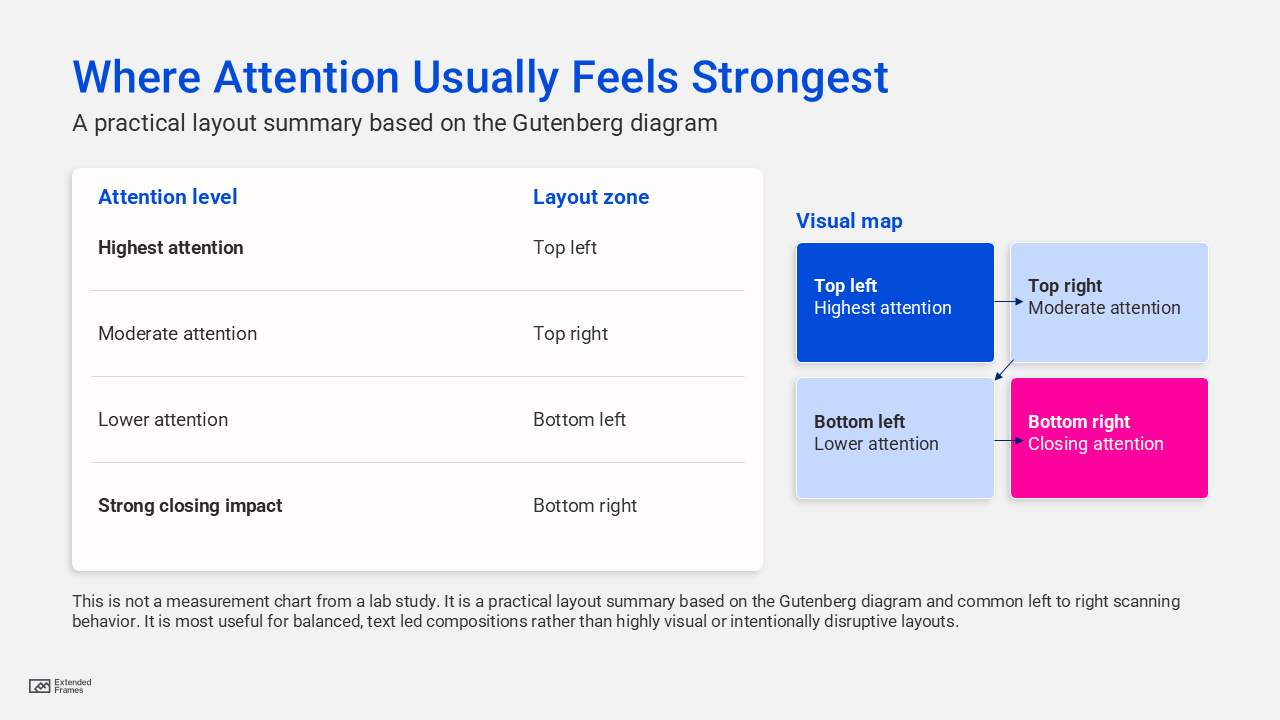
This is not a measurement chart from a lab study. It is a practical layout summary based on the Gutenberg diagram and common left to right scanning behavior. It is most useful for balanced, text-led compositions rather than highly visual or intentionally disruptive layouts
Gutenberg principle vs F pattern vs Z pattern
A lot of designers mix these up, and that is understandable. They all describe attention flow, but they are not best suited to the same situations.
| Pattern | Best use case | What it suggests |
|---|---|---|
| Gutenberg principle | Balanced, text-heavy, evenly distributed layouts | Guide the eye from top left to bottom right |
| F pattern | Text-heavy pages people scan quickly | Strong attention at the top and left side |
| Z pattern | Simpler promotional or landing layouts | Lead the eye across a clear visual route with focal stops |
The important point is that scanning depends on layout and task. Nielsen Norman Group’s research shows people do not all read in one fixed pattern. The Gutenberg principle is simply one very useful model when the layout is orderly and the content is fairly homogeneous.
When the Gutenberg principle helps most
The principle in presentation design is most useful when:
- the slide has one clear message
- the layout is clean and balanced
- the content is mainly text, labels, charts, or structured visuals
- the audience needs fast comprehension
- the slide may be read without a speaker present
These use cases line up well with presentation guidance from MIT and UC San Diego, both of which stress concise slide communication, clear main messages, and deliberate attention cues.
When not to force it
This principle is helpful, but it is not something to force onto every slide. It becomes less useful when:
- the slide is image-led and dominated by one large focal visual
- motion or progressive builds intentionally control the reading order
- the audience reads in a different direction, such as right to left contexts
- accessibility reading order has been broken by manual object placement
- the design intentionally uses a different entry point for storytelling or dramatic effect
This last point is important more than many designers realize. Section 508 guidance explains that screen readers do not follow what looks visually correct by default. They follow the object reading order on the slide. So even if a layout looks aligned with natural reading flow, it can still fail accessibility if the title, text, and graphics are stacked in the wrong order behind the scenes.
The accessibility angle most presentation designers miss
A clean visual layout is not automatically an accessible layout. Government accessibility guidance for PowerPoint recommends using structured layouts, keeping the title first, and checking reading order so assistive technology follows the intended sequence. Custom text boxes and decorative rearrangements can break that logic.
That is a valuable reminder: the Gutenberg principle should shape the visual experience, but your slide also needs a logical document structure. Good presentation design is where readability, hierarchy, and accessibility all support each other.
A checklist for designers
Before finalizing a slide, ask:
| Question | Why it matters |
|---|---|
| Does the title communicate the main point right away? | The title is often the entry point |
| Is the eye guided naturally to the supporting evidence? | Good hierarchy reduces confusion |
| Does the slide end on a clear takeaway or next step? | The exit point should feel intentional |
| Is anything important hiding in a weak attention zone? | Key content may be missed |
| Is the reading order accessible behind the scenes? | Screen readers need logical object order |
This checklist brings together visual hierarchy guidance, slide design best practices, and accessibility requirements in one workflow.
The Gutenberg principle is easy to dismiss because it sounds old. But that is also why it is useful. It reminds us that design is not just arrangement. It is guidance. In presentation design, that matters a lot. Your audience is moving fast, often distracted, and rarely interested in working harder to decode a slide than they need to.
When you use the Gutenberg principle in presentation design, you are not following a rigid formula. You are working with the audience’s likely reading flow, strengthening visual hierarchy, and making each slide feel more natural to process. That usually leads to a better presentation, whether it is projected in a room, shared as a PDF, or opened later on someone’s laptop.