
What Is the Rule of Thirds in Presentation Design?
The rule of thirds in presentation design is a simple layout principle that divides a slide into nine equal sections using two horizontal lines and two vertical lines. Instead of centering every element, you place key content along those lines or near their intersections. This creates a layout that feels more balanced, intentional, and visually engaging. Interaction Design Foundation defines the rule of thirds this way and explains that placing important elements on the grid or its intersections helps create a more visually appealing interface.
In presentation design, this is important because audiences do not read slides the way they read documents. They scan. They look for the focal point first, then for supporting content. Adobe’s visual hierarchy guidance explains that designers create a natural viewing order by organizing elements according to importance through emphasis, placement, scale, and proportion. The rule of thirds gives presentation designers a practical way to do exactly that.
Why the rule of thirds works
The rule of thirds creates balance without making the slide feel static. Centered layouts can feel formal and symmetrical, but they can also feel flat when every element sits in the middle. By shifting a key image, headline, or callout to a third line or one of the four intersection points, the slide gains movement and focus while still feeling organized. IxDF describes those intersections as powerful positions for key elements, and Six Minutes applies the same idea directly to PowerPoint slide composition.
It also supports visual breathing room. IxDF notes that the rule of thirds can help prevent overcrowding by distributing elements more evenly and giving them room to breathe. That is especially useful in presentations, where the goal is not to show everything at once, but to make one idea easy to understand quickly.
Another reason it works is that it is easy to apply. You do not need to be a trained designer to use it. You can simply imagine a 3 by 3 grid over your slide, choose the one thing people should notice first, and place it on a third line or intersection. Six Minutes even recommends using PowerPoint guides to draw those lines into your template so the structure is visible while you design.
The rule of thirds on a slide
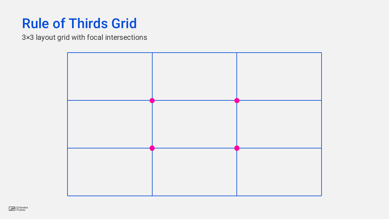
The grid above divides the slide into nine equal areas. The dots represent the four intersections where attention tends to be strongest. Those are often the best places to position an image, a headline, a callout, or another key visual element. Both IxDF and DaSy Center describe these intersections as the strongest points for placing critical elements.
How to use the rule of thirds in presentation design
1. Place the main visual off-center
If your slide uses a photo, product image, illustration, or portrait, avoid centering it by default. Try aligning the main subject to the left or right vertical third instead. This gives the composition more energy and leaves better room for text. Six Minutes specifically recommends placing key graphic elements on the third lines or intersections rather than automatically centering them.
2. Position the headline on a third line
On statement slides, title slides, or opening slides, try placing the headline near the upper horizontal third instead of centering it in the middle of the slide. That helps the message land faster and leaves more space below for support content. Since Adobe explains that visual hierarchy is created by organizing elements from most to least important, headline placement is one of the easiest ways to signal priority.
3. Use one intersection as the focal anchor
Not every slide needs multiple points of emphasis. In fact, most strong slides do better with one clear focal area. DaSy Center, referencing Stephanie Evergreen’s presentation design principles, notes that the four points of intersection are the best places to position images and other important elements, especially on lighter text slides.
4. Let empty space stay empty
One of the biggest mistakes in presentation design is filling every part of the slide. The rule of thirds helps you resist that. If one third of the slide is intentionally left open, the rest of the layout often feels clearer and more premium. IxDF notes that the technique improves readability by preventing overcrowding and allowing elements to breathe.
5. Crop images with thirds in mind
The rule of thirds is not only about placing objects on a slide. It also helps when cropping full-bleed images. If a person’s face, a product, or another important subject sits near an intersection point, the image usually feels more professional and better composed. Six Minutes discusses this directly in the context of using the rule of thirds for PowerPoint slides and image placement.
Centered layout vs rule-of-thirds layout
| Layout style | Visual effect | Best use | Main risk |
|---|---|---|---|
| Centered layout | Stable, formal, symmetrical | Title slides, very minimal slides, official statements | Can feel flat or predictable |
| Rule-of-thirds layout | Dynamic, balanced, directional | Image-led slides, keynote slides, storytelling slides, marketing decks | Can feel forced if overused |
| Hybrid layout | Structured with one asymmetrical focal point | Business presentations that need both clarity and polish | Needs discipline to avoid clutter |
This comparison is an applied interpretation of the composition guidance from IxDF, Adobe, DaSy Center, and Six Minutes. The sources support the underlying design logic, while the table translates that logic into presentation use cases.
Where the rule of thirds works best in slides
| Slide type | How to apply it |
|---|---|
| Title slide | Put the headline on the upper third and the hero image on the left or right third |
| Quote slide | Place the quote block near an upper intersection instead of centering it |
| Product slide | Put the product on one vertical third and benefits on the opposite side |
| Case study slide | Use one third for the visual anchor and the other side for proof points |
| Data highlight slide | Place the chart as the main anchor and the key takeaway near a focal intersection |
These examples align with DaSy Center’s guidance that the rule of thirds is best for lighter text slides and for placing critical elements on the grid intersections.
A simple way to apply it to every slide
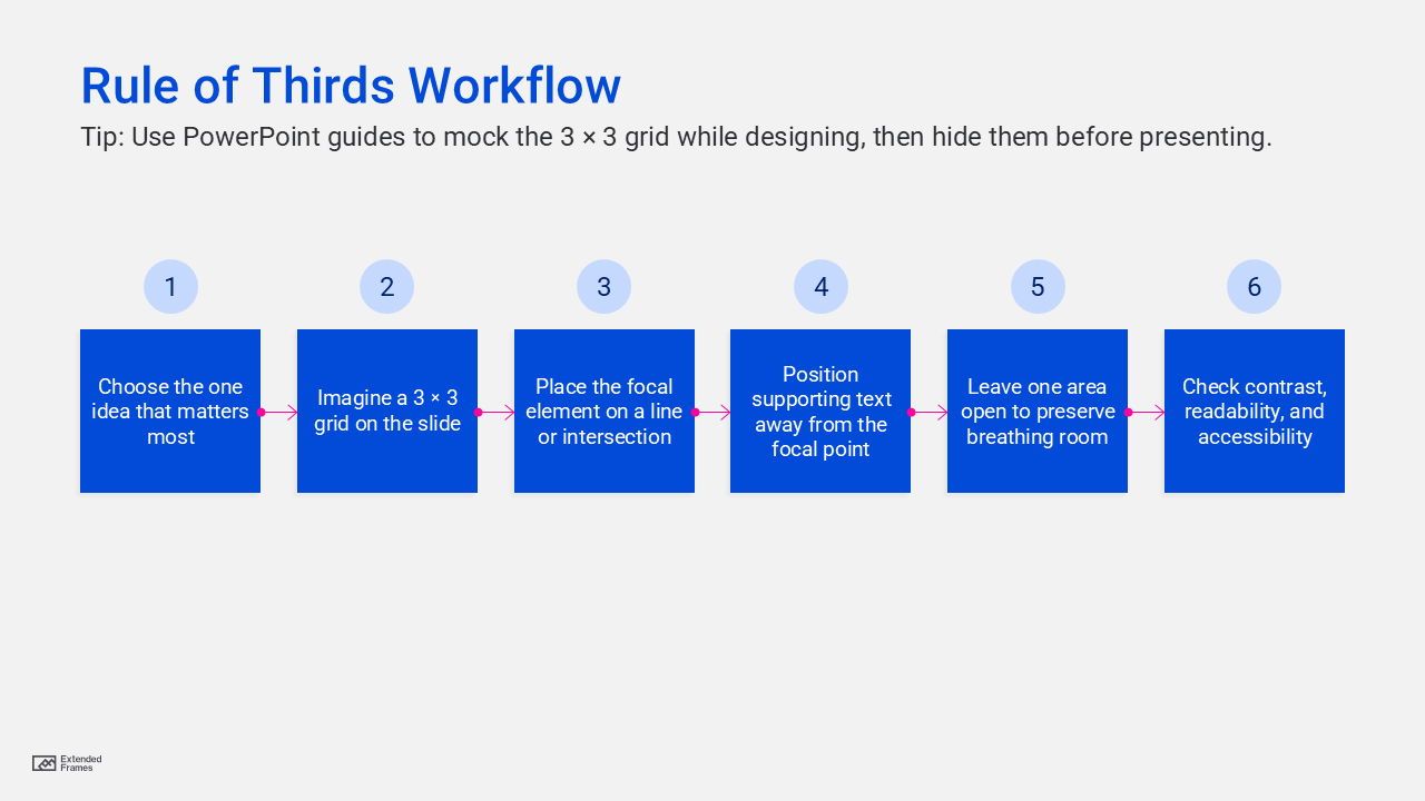
This workflow combines the rule-of-thirds placement model with accessibility and readability practices recommended in Microsoft’s PowerPoint guidance. Microsoft advises checking accessibility while you work, adding alt text to visuals, and using accessible font formatting and color.
When not to use the rule of thirds
The rule of thirds is useful, but it is not the right answer for every slide. DaSy Center notes that it is best for lighter text slides, while the Gutenberg Diagram is more useful for heavier text slides because it better reflects how viewers scan text-based layouts.
That means you do not need to force every slide into an asymmetrical composition. If a slide is data-heavy, process-heavy, or built around a table, readability matters more than visual drama. The smartest use of the rule of thirds is selective use. It is a design tool, not a design law.
When to avoid using the rule of thirds in presentation design
| Mistake | Why it weakens the slide | Better approach |
|---|---|---|
| Treating all four intersections as equally important | The slide loses hierarchy | Choose one main focal point |
| Keeping too much text | The layout still feels crowded | Reduce copy before adjusting placement |
| Using the grid but ignoring contrast and scale | The focal point is still unclear | Pair placement with size and emphasis |
| Forcing asymmetry on every slide | The deck starts to feel repetitive or gimmicky | Mix thirds-based slides with simpler layouts |
| Ignoring accessibility | The slide may look good but be harder to read or use | Check font, color, alt text, and accessibility while designing |
Adobe’s hierarchy guidance supports the need for emphasis, scale, and ordering. Microsoft’s PowerPoint accessibility guidance supports checking readability, alt text, font format, and color while building slides.
Accessibility matters too
Good composition should not come at the cost of usability. Microsoft recommends using the Accessibility Checker while building slides, adding alt text to visuals, using accessible font formatting and color, and being careful with tables and other complex elements. That means a well-composed slide should also be easy to read from a distance, clear in contrast, and understandable to users of assistive technology
If the rule of thirds helps create a cleaner visual hierarchy, accessibility helps make sure that hierarchy is actually usable. In real presentation design, both need to work together.
The rule of thirds in presentation design is a practical way to create slides that feel more balanced, more intentional, and easier to follow. By dividing the slide into a simple 3 by 3 grid and placing key elements on the lines or intersections, you give your audience a clearer place to look first. That alone can make a slide feel more professional.
The goal is not to make every slide artistic. The goal is to make every slide easier to understand. Use the rule of thirds when you want a layout to feel less static, when you want one message to stand out, or when you want a photo or visual to carry more of the story. Use it selectively, pair it with strong hierarchy and accessibility, and it becomes a very effective presentation design tool.