

Minimalist Presentation Design
Minimalist presentation design helps an audience understand your message faster because it removes visual noise, clarifies hierarchy, and makes each slide easier to scan.
That does not mean stripping a slide down until almost nothing remains.
A good minimalist slide still gives people the context they need. It simply makes the important information easier to find and the supporting information easier to follow.
This lines up with Mayer’s Cognitive Theory of Multimedia Learning, which argues that people process visual and auditory information through channels with limited capacity, and that unnecessary material can interfere with learning.
The practical question for presentation design is straightforward: what does the audience need in order to understand this slide, and what is getting in the way?
What minimalist presentation design means
Minimalist presentation design is really an editing discipline.
For every title, paragraph, chart, image, icon, or decorative element, ask whether it helps the audience understand the point of the slide.
If it clarifies the message, provides necessary evidence, or helps establish hierarchy, it has a reason to be there.
If it is filling space or competing for attention without adding meaning, it probably does not.
Nielsen Norman Group makes a similar distinction in its guidance on aesthetic and minimalist design: the objective is to reduce unnecessary information without removing elements people genuinely need.
That is particularly relevant to presentations.
A chart may need a source. A number may need a timeframe. A recommendation may need a sentence of context. Removing those details because they make the slide look cleaner can leave the audience with more work, not less.
Why minimalist slides work better
Clutter makes people decide where to look before they can start understanding the message.
If a slide contains several competing headlines, colors, text blocks, charts, and decorative elements, the audience has to sort through those signals before the content becomes clear.
Mayer’s coherence principle is useful here: people learn better when extraneous words, pictures, and sounds are excluded rather than included.
But there is an important distinction between a slide that is minimal and one that is simply empty.
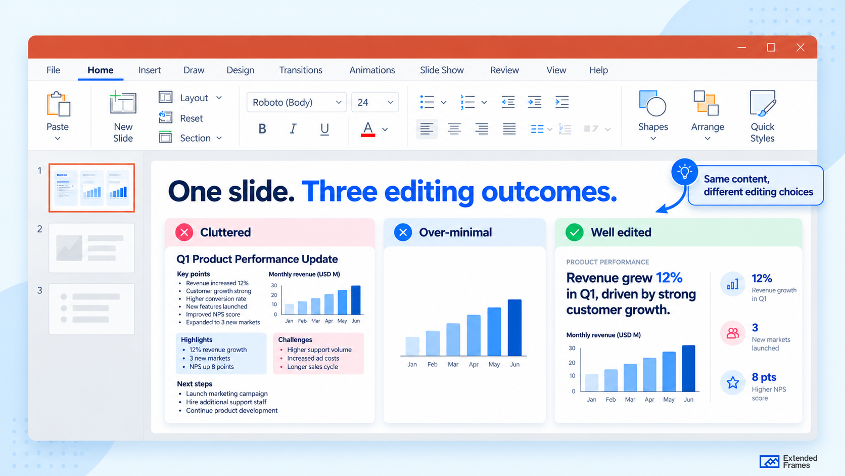
| Slide style | What the audience experiences | Likely result |
|---|---|---|
| 1- Dense and cluttered | Several competing entry points and too much reading | Lower focus, slower comprehension |
| 2- Visually sparse but vague | Clean appearance with too little context | Attractive slide, unclear message |
| 3- Minimalist and message-led | Clear takeaway, useful evidence, controlled hierarchy | Faster understanding, clearer takeaway |
The third option is the goal. Minimalist presentation design works when clarity leads the design, not when aesthetics lead the design.
Core principles of minimalist presentation design
1. Give each slide a clear point
A minimalist slide begins with message discipline. MIT recommends that each slide convey a single idea, and that the title itself communicate the takeaway. This is one of the fastest ways to make a deck feel cleaner without changing the brand, color palette, or layout system.
Instead of a title like “Market Overview,” a minimalist slide title would say something clearer, such as “Demand is shifting fastest in mid market accounts.” That title already does some of the communication work before the audience even looks at the chart.
2. Use titles as part of the explanation
Presentation titles are often treated as navigation labels:
- Financial Performance
- Customer Research
- Product Roadmap
Those titles tell people where they are in the deck but leave the interpretation to them.
Where the evidence allows it, use the title to communicate what the slide has established:
Enterprise renewals drove most of the Q3 growth
or:
Customers value speed more than additional features
Now the title and the evidence have different roles. The title states the conclusion. The rest of the slide shows why.
A label tells people what they are looking at. A takeaway tells them why it matters.
3. Let whitespace create focus
Whitespace is useful because it creates separation.
Objects placed close together feel related. More space between elements tells the audience they belong to different groups. Extra room around a headline, number, or visual can also increase its visual priority.
Many slides that look overcrowded do not necessarily need half their content deleted. They need the relationships between the content to become clearer.
That is why spacing can change a slide considerably without changing a single word.
That principle can also work on slides that genuinely need several pieces of information. A Bento grid layout uses spacing and differently sized modules to keep related content visible while giving the most important element greater visual weight.
We go deeper into this in Slide Spacing: The Most Underrated Slide Skill.
4. Build hierarchy with scale, contrast, and grouping
Minimal slides depend heavily on hierarchy because there are fewer decorative cues competing for attention.
The audience should be able to distinguish the takeaway, the main evidence, the supporting information, and the secondary detail without inspecting every object first.
Scale, contrast, grouping, position, and spacing can establish that order without adding more elements.
For a deeper look at how those decisions affect slides, documents, dashboards, and other design work, see our guide to Visual Hierarchy in Design and Presentation.
When hierarchy is working, the slide tells the audience where to begin.
5. Keep color and typography controlled
Minimalist slides become harder to read when every content type receives its own color or typographic treatment.
A neutral base, a clear text color, and one purposeful accent can handle a surprising amount of information.
Typography works the same way. One typeface with a deliberate range of sizes and weights can create more than enough hierarchy.
Nielsen Norman Group also warns against unnecessary color and font variation because each additional treatment introduces another signal the user has to interpret.
Color should tell the audience something. If six different elements are highlighted, highlighting has stopped being useful.
6. Keep text readable before you make it smaller
Reducing the font size is one of the fastest ways to make a crowded slide appear cleaner.
It is also one of the easiest ways to make the slide worse.
If the content only fits once the type becomes uncomfortable to read, something else needs to change: the copy, the layout, the grouping, or the number of slides.
Microsoft recommends concise slide text and warns against overcrowding presentations with small type.
A slide is not improved by fitting more onto it than the audience can comfortably read.
7. Use visuals as evidence
Charts, photographs, diagrams, and icons can replace lengthy explanations. They can also become another source of noise.
Before adding a visual, ask what it contributes.
- A chart can prove the headline.
- A diagram can explain a relationship.
- A photograph can show something the audience cannot understand as quickly from text.
- A decorative image that is there because the slide feels empty has a much weaker job.
The implication is simple: visuals should earn their place. A chart, icon, diagram, or photo should clarify meaning. Decorative stock imagery often weakens minimalist presentation design because it adds shape without adding information.
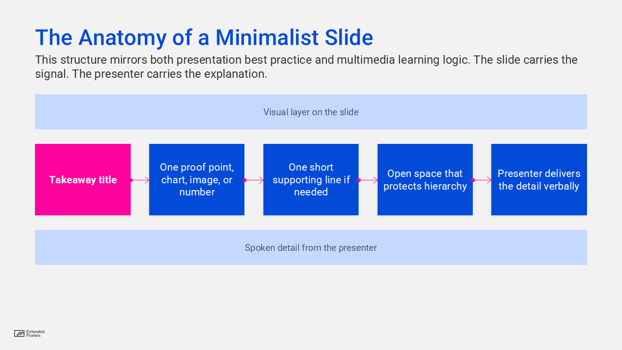
The anatomy of a minimalist slide
Minimalist presentation design for data slides
Data slides are where restraint often disappears.
A generic title sits above a default chart. Every series has its own color. Gridlines, legends, markers, labels, and annotations all compete at similar strength. Then the audience is expected to find the point.
A better approach starts with the conclusion.
If the message is that customer churn increased sharply after May, say that in the title. Keep the evidence needed to support it. Reduce the visual weight of information that provides context but is not the focus.
A useful minimalist data slide might remove unnecessary gridlines, reduce redundant labels, highlight one important series, label it directly, and add one annotation where the change occurs.
The chart still contains evidence. Its hierarchy simply becomes clearer.
For more on selecting and formatting charts, see Data Visualization in PowerPoint: Pick the Right Chart.
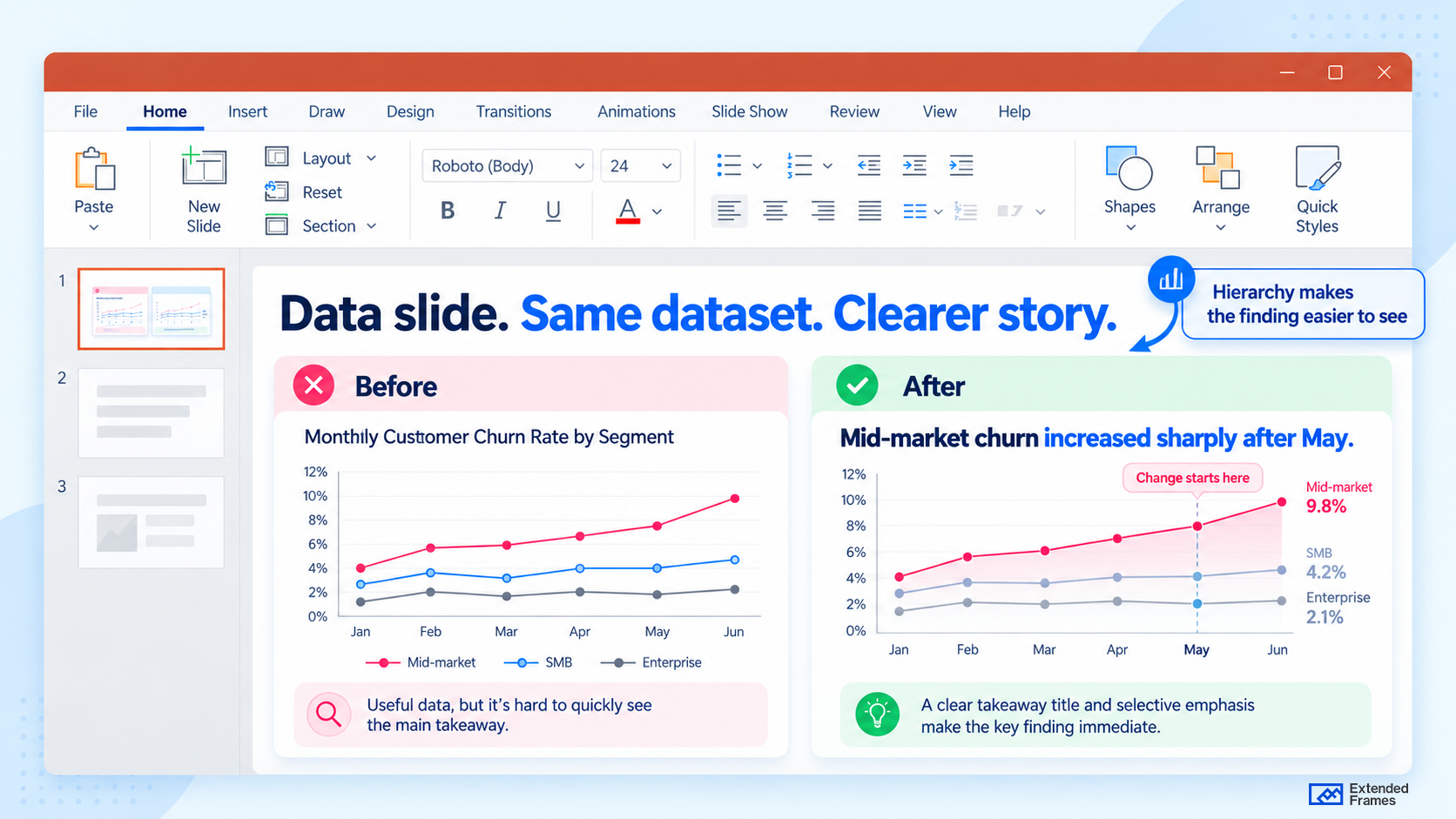
The dataset is unchanged. The redesign makes the main finding easier to see.
Where minimalist design often goes wrong
Minimalism can be powerful, but it can also become superficial. Minimalist design is useful only when it supports user needs, not when it is applied for style alone. In presentations, the same mistake appears when slides look elegant but lack enough context to persuade, explain, or guide action.
Too much context disappears
Sources, units, dates, baselines, and comparison points are often visually quiet, which makes them tempting to remove. If the audience needs that information to interpret the message correctly, keep it and reduce its visual prominence instead.
Contrast becomes too subtle
Light gray text on white can look sophisticated on a laptop and become almost unreadable on a projector.
W3C’s WCAG guidance specifies a minimum contrast ratio of 4.5:1 for normal text and 3:1 for large text.
Live text becomes artwork
Another shortcut is turning text-heavy content into images because the layout becomes easier to control.
That creates other problems. Text inside an image is harder to edit, scale, search, and use with assistive technology.
Microsoft’s PowerPoint accessibility guidance recommends keeping content in accessible structures, maintaining a logical reading order, using meaningful titles, and ensuring text remains readable.
Keep important copy as live text whenever possible.
Simplicity becomes sameness
Minimalist presentations can become monotonous when every slide uses the same composition.
Consistency is useful. Repetition without variation is not.
A data slide, comparison, quote, and strategy slide can belong to one visual system without sharing an identical layout.
That distinction becomes increasingly important in longer B2B decks.
What to keep and what to cut
| Keep | Cut or reduce |
|---|---|
| Takeaway title | Topic-only title |
| One key chart or visual | Several unrelated visuals |
| Short supporting text | Paragraphs copied onto the slide |
| One purposeful accent | Competing highlight colors |
| Consistent typography | Decorative font changes |
| Clear spacing and alignment | Objects pushed into every available area |
| Direct annotations | Charts that need verbal decoding |
| Necessary context | Detail that does not change understanding |
The objective is not to reach the smallest possible number of elements. Stop editing when the slide becomes clear.
How minimalist design changes across slide types
Different slides need different forms of restraint.
| Slide type | Useful minimalist approach | What usually gets in the way |
|---|---|---|
| Title slide | Clear title, necessary context, strong composition | Too many logos, dates, slogans, and decorative elements |
| Agenda | Short section list with clear grouping | Paragraph-style agenda |
| Section divider | One statement that sets up what comes next | Decorative divider with no direction |
| Data slide | Takeaway title, simplified chart, one clear emphasis | Default chart styling and competing series |
| Comparison | A few decisive criteria | Large matrix where every difference has equal weight |
| Quote | Short quotation, attribution, enough space | Long quotation reduced to small type |
| Closing slide | Recommendation, next step, or action | Generic “Thank you” slide |
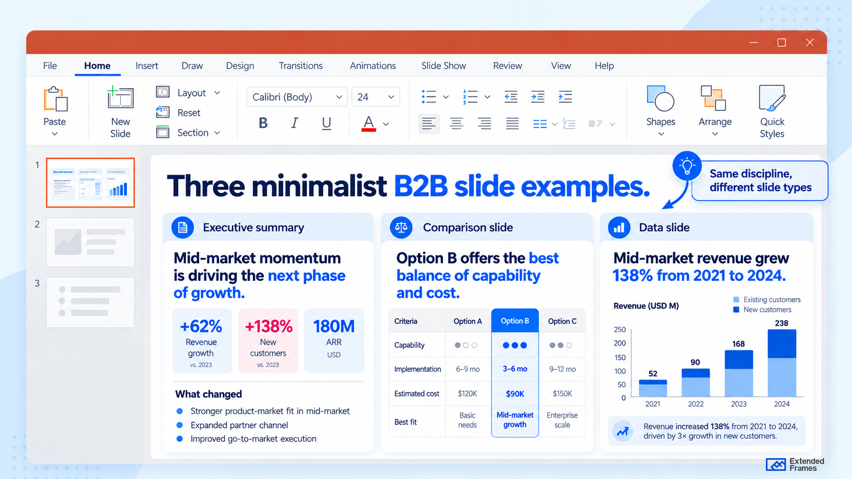
The layouts do not need to repeat. What stays consistent is the hierarchy and reading order.
Accessibility is part of good minimalist presentation design
Minimalist presentation design becomes stronger when accessibility is treated as a design standard. Microsoft recommends built-in slide layouts because they preserve reading order for assistive technologies, unique slide titles because users rely on them to navigate, simple table structures for data, accessible font sizing, and sufficient white space.
That is useful beyond accessibility. These same habits improve the experience for everyone in the room. The cleaner the structure, the easier the message is to follow.
A simple check before you move on
Before finalizing a slide, ask these five questions:
| Question | If the answer is no |
|---|---|
| Is the takeaway obvious in the title? | Rewrite the title first |
| Does every element support that takeaway? | Remove anything extra |
| Is the first focal point obvious at a glance? | Strengthen hierarchy |
| Can the back row read it comfortably? | Increase font size and contrast |
| Would the slide still work if shared as a PDF? | Fix text, labels, and accessibility |
That is where minimalist presentation design becomes useful as a working method rather than an aesthetic preference.
Minimalism works when clarity survives the edit
A good minimalist presentation can still contain detailed charts, complex information, photography, diagrams, and supporting context.
What changes is how those elements are edited and prioritized.
Remove what competes unnecessarily. Keep what the audience needs. Give the important information enough visual weight to lead.
The result will often look calmer, but the calmer appearance is a consequence of better decisions rather than the objective.
For B2B teams, those decisions frequently happen before the finished slide is designed: clarifying the takeaway, restructuring content, deciding what belongs on the main slide, and moving secondary detail somewhere more appropriate.
That is also part of how we work at Extended Frames. Our Business Presentation Design service covers the thinking behind the slide as well as the finished design, from restructuring the content to producing polished, editable presentations.