
Bento grid layouts are useful on slides because they give mixed content a visible structure. A headline, metric, screenshot, quote, and short explanation can sit on the same slide without competing for the same space.
The grid does the organizing. Larger modules carry the main point. Smaller modules hold proof, detail, or context. When that hierarchy is clear, a content-heavy slide can still feel composed.
For business presentations, this becomes useful when one slide needs to combine several kinds of information: a product overview with a screenshot and proof point, a case study with results and context, or an executive summary with several related signals.
The important part is the hierarchy. A collection of rounded rectangles is still just a collection of rounded rectangles if every box carries the same weight.
What is a Bento grid layout in a presentation?
A Bento layout divides the slide into a system of related modules. Those modules can vary in size and purpose, but they still belong to one overall composition.
One might carry the main message. Another might hold a metric. A larger area could contain a product screenshot while a smaller one provides context or evidence.
That logic comes from established grid systems. Modular grids use rows and columns to create repeatable areas for content, while hierarchical grids allow more important information to occupy more space.
That distinction is useful in presentation design.
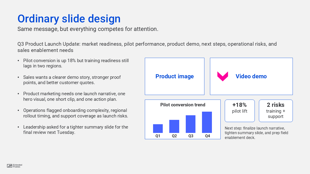
If six cards are identical in size, contrast, and visual weight, the audience still has to decide where to look first. Giving the primary message more space, stronger contrast, or a more prominent position creates hierarchy before anyone starts reading.
That is also why visual hierarchy in presentation design remains more important than the Bento pattern itself. The grid should make the order of information easier to understand, not become the thing people notice first.
Why Bento layouts work well for mixed-content slides
Presentations become difficult to follow when several pieces of information all demand attention at once. A paragraph, chart, product screenshot, statistic, and callout can technically fit on one slide.
Bento layouts create separation without disconnecting the content. A screenshot can occupy one module while a result sits beside it. Supporting context can remain visible without being given the same prominence as the main message.
This is particularly useful because people have limited capacity to process information at any one time. UC San Diego’s overview of multimedia learning principles describes limited processing capacity and the need to select and organize relevant information rather than forcing audiences to decode everything simultaneously.
A grid does not solve that problem automatically. It simply gives the designer a structure for deciding what deserves attention and what should remain secondary.
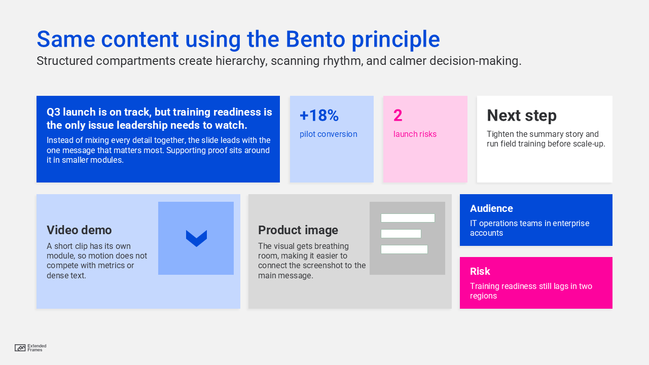
Bento slide balance model
This is a practical planning model, not a universal rule, but it is a useful starting point for content-heavy business slides.
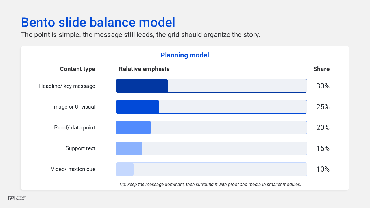
Traditional slide vs Bento slide
| Element | Traditional crowded slide | Bento-style modular slide |
|---|---|---|
| Headline | Often competes with everything else | Given a clear primary zone |
| Text | Long paragraph or bullet block | Broken into shorter supporting modules |
| Imagery | Added wherever space remains | Given a defined role in the composition |
| Video | Often inserted as an extra | Treated as an intentional content area |
| Data | Can feel detached from the message | Positioned close to the claim it supports |
| Reading flow | Audience has to work it out | Hierarchy and spacing provide direction |
What makes a Bento slide different from a card grid?
Cards alone do not create a useful Bento layout.
The stronger examples usually have a dominant module, supporting modules with different roles, consistent alignment, deliberate gaps between them, and enough empty space for the hierarchy to remain visible.
This is where hierarchical grids become particularly relevant. Nielsen Norman Group describes hierarchical grids as layouts where more important content occupies larger areas of the grid. It also identifies columns, gutters, and margins as the basic structural parts of a grid.
For slides, that means a key conclusion might occupy half the composition while supporting metrics sit in smaller modules nearby. A product screenshot might be the largest element, with benefits and evidence placed around it.
The module sizes are doing some of the communication before the words are read.
The modules that make a Bento slide work
The exact modules depend on the content, but business slides tend to use a few recurring roles.
| Module | Best use | Design consideration |
|---|---|---|
| Message module | Main takeaway or recommendation | Give it clear visual priority |
| Metric module | KPI, result, or proof point | Keep the number easy to find |
| Evidence module | Quote, finding, or supporting fact | Keep supporting copy concise |
| Image or screenshot module | Product UI, photograph, diagram | Use it because it explains something |
| Context module | Short explanation or qualifier | Keep it visually secondary |
| Action module | Decision, next step, recommendation | Make the requested action easy to identify |
Not every slide needs all six. A product slide might need a screenshot, message, metric, and short explanation. An executive summary might work with one dominant conclusion and three supporting signals.
The content should determine the modules.
Balancing text, imagery, data, and video
More modules should not mean more content.
If a large screenshot is already carrying much of the explanation, the surrounding text can become lighter. If a metric needs attention, it should not compete with three equally prominent illustrations. If a video thumbnail has a genuine role in the presentation, the surrounding modules need enough restraint for it to remain noticeable.
The multimedia-learning guidance mentioned earlier is useful here because it distinguishes between information that supports understanding and cognitive effort spent on material that does not.
This makes editing part of the layout process.
Before creating another module, ask whether the audience actually needs another piece of information on that slide. Sometimes the better Bento layout has four modules instead of six. Sometimes the better answer is not to use a Bento layout at all.
Setting up a Bento grid in PowerPoint
You do not need a visible twelve-column template sitting behind every slide. You do need repeatable alignment.
For a 16:9 presentation, a 12-column internal grid can be a flexible starting point because modules can span two, three, four, six, or twelve columns. Treat that as a working framework rather than a PowerPoint rule.
Start with consistent outer margins, establish repeatable gaps between modules, and decide how much internal padding cards will use. PowerPoint guides can then help keep shared edges aligned as the composition changes from slide to slide.
Spacing has a large influence on whether those modules feel connected or chaotic. Our guide to slide spacing in PowerPoint goes deeper into margins, proximity, group spacing, and internal padding.
A practical starting framework might look like this:
| Layout decision | Starting point |
|---|---|
| Slide format | 16:9 widescreen |
| Internal grid | 12 flexible columns |
| Outer margins | Consistent across the deck |
| Gutters | Repeated rather than adjusted card by card |
| Internal card padding | One consistent system |
| Module count | Usually a small number with distinct roles |
| Dominant module | Use when one idea genuinely deserves priority |
The values can change from deck to deck. Consistency within the system is more important than following one fixed measurement.
Where Bento grid layouts can fail
Not every slide improves when it is divided into modules.
Bento layouts start to break down when every card is the same size and importance. If nothing dominates, the audience has to inspect every section before discovering the point.
They also become difficult when too many small modules are introduced, gutters keep changing, several charts and screenshots compete at once, or the grid becomes more visible than the message.
Sometimes a slide only needs one chart and a clear conclusion. Sometimes it needs one photograph and one sentence. Forcing those into five cards adds structure that the content never asked for.
The Bento pattern earns its place when several related pieces of information genuinely need to be understood together.
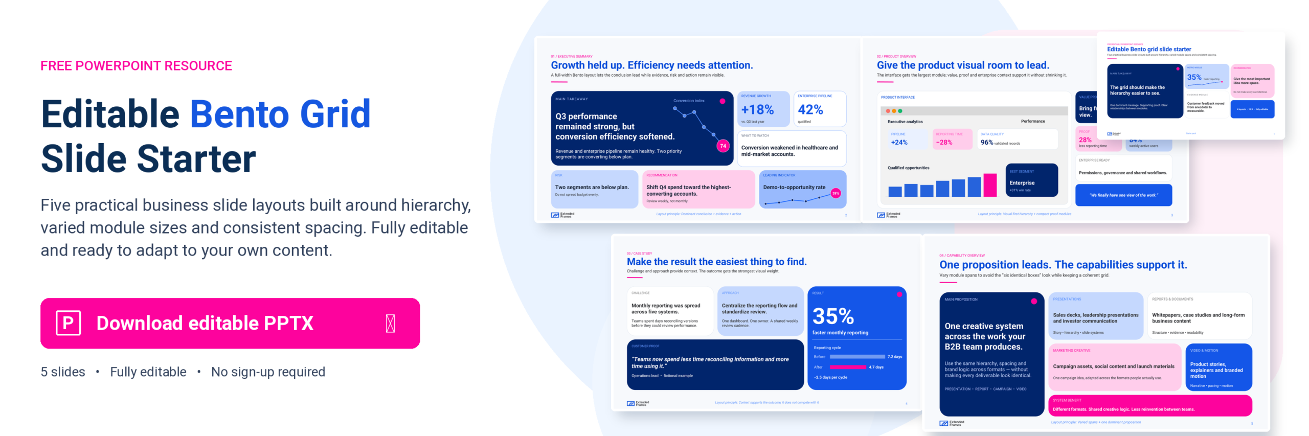
Where Bento layouts work particularly well
An executive summary can use one dominant conclusion with smaller modules for KPIs, risk, and the recommended decision.
A product overview can give the interface or product image most of the space, then use smaller areas for the value proposition, supporting evidence, and customer outcome.
A case study can separate the challenge, solution, result, and customer proof while keeping all four visible as one story.
A capability slide can establish the main proposition first and use supporting modules for capabilities, process, examples, or evidence.
These slides still need one main idea. The Bento structure simply gives the supporting information somewhere useful to go.
That principle also appears throughout our PowerPoint slide design guide for non-designers establish what the audience should understand before making layout and styling decisions.
How to build a Bento slide
Start with the content rather than drawing cards first.
- Write the takeaway the slide needs to communicate.
- Separate the supporting information into distinct roles such as evidence, image, metric, context, or action.
- Rank those pieces by importance.
- Create a simple internal grid using PowerPoint guides.
- Give the dominant idea enough space to establish the hierarchy.
- Place supporting modules around it using shared edges and consistent gutters.
- Remove modules that repeat or weaken the message.
- View the slide at presentation size rather than judging it only while zoomed in during editing.
This order is important because it prevents the Bento aesthetic from dictating the content.
The layout should emerge from the relationships between the information.
Bento works best when the content actually needs a system
Bento layouts are most useful when a slide contains several related pieces of information that need to be understood together.
The grid gives those pieces order, but it should never become more noticeable than the message itself.
If the content only needs one chart, one image, or one sentence, use the simpler slide. If it needs a headline, proof, context, and visual evidence together, a modular layout can give each one the space it needs.
That same judgment sits behind our presentation design work for B2B teams, where the layout follows the content, audience, and story rather than forcing every slide into one design pattern.