Bento Grid Layouts for Slides: How Modular Design Makes Presentations Easier to Read
There is a reason Bento grid layouts for slides feel fresh right now. They solve a problem that has been quietly hurting presentations for years: too much information competing in one flat space. When a slide is organized like a Bento box, each idea gets its own compartment, its own rhythm, and its own role. That make it easier for people to process information better, when content is broken into smaller chunks, visual clutter is reduced, and the order of importance is clear.
This is a disciplined way to structure narrative, evidence, and media on a slide. The strongest Bento-style slides are built on design fundamentals that are already well established: grid systems help organize information consistently, cards group related content into flexible containers, and visual hierarchy guides the audience to what important first.
The thought leadership opportunity here is bigger than style. Bento grid layouts for slides point toward a smarter presentation language for modern teams. They give presenters a way to combine short text, proof points, imagery, product UI, and video without collapsing into chaos. They also support modular thinking, which means slides become easier to build, easier to review, and easier to reuse across sales, strategy, training, and internal communication.
What a Bento grid layout
A Bento slide is not simply a slide with boxes on it. It is a modular grid that separates one large message into smaller, related units. Each compartment has a job. One module may hold the headline. Another may hold a short stat. Another may carry an image, a product clip, or a pull quote. The slide still tells one story, but it tells it through coordinated parts instead of one oversized block. That logic mirrors how modular grids use rows and columns to organize content into a matrix structure.
Understanding that distinction is important, when designers use compartments without hierarchy, the result looks busy. When they use compartments with purpose, the result feels calm, precise, and premium. The audience can scan the slide, understand the structure quickly, and decide where to focus next. That is exactly what strong visual hierarchy is supposed to do.
Why this layout style works so well in presentations
Presentations fail when every element asks for equal attention. A deck becomes tiring when the audience must work too hard to decode what belongs together, what matters most, and where to look next. Research in UX and multimedia learning points in the same direction: break information into meaningful chunks, reduce extraneous load, and remove irrelevant material that competes for attention.
That is why Bento layouts feel natural on slides. They convert one crowded canvas into a set of readable decisions. Instead of asking the audience to process a paragraph, a chart, a product screenshot, and a video thumbnail as one undifferentiated mass, the layout distributes the load. The audience sees relationships faster because the structure is visible. Cards and compartments make the story scannable.
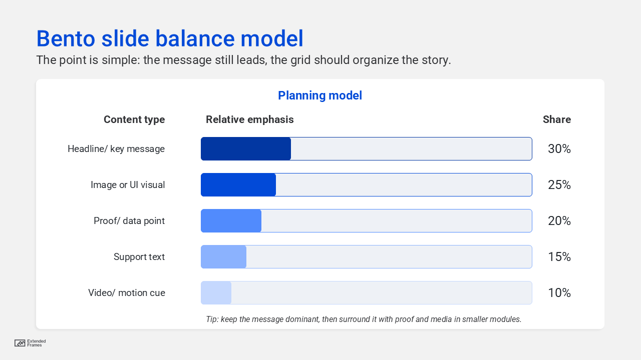
Bento slide balance model
This is an editorial planning model, not a universal rule, but it is a good starting point for content-heavy business slides:
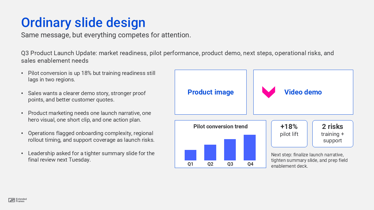
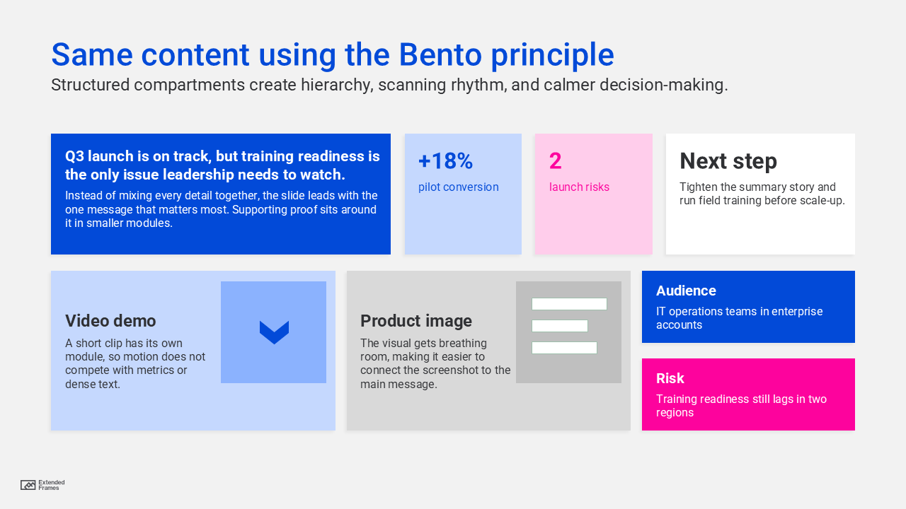
Traditional slide vs Bento slide
| Element | Traditional crowded slide | Bento-style modular slide |
|---|---|---|
| Headline | Often competes with everything else | Given a clear primary zone |
| Text | Long paragraph or bullets | Broken into short, scannable modules |
| Imagery | Decorative or oversized | Assigned a defined role |
| Video | Dropped in as an extra | Used as one intentional content block |
| Data | Feels detached from the message | Paired with related text or proof |
| Reading flow | Unclear | Guided by hierarchy and spacing |
The difference is not decoration, … it’s structure.
Why modular design is important for teams, and not just for slides
The effectiveness of this approach shows up when presentations are built at scale. A modular system reduces design guesswork. Spatial rules and grids create a repeatable rhythm, constrain unnecessary decisions, and help teams stay aligned. Designers, marketers, consultants, and presenters work faster when they are not reinventing layout logic for every slide.
This is where Bento grid layouts for slides become more than a visual choice. Once a team defines a few reusable module types, such as headline card, metric card, proof card, media card, and CTA card, slide creation becomes more consistent across decks. That consistency is not boring. It is what gives the brand a stable visual language while still allowing variety inside the grid.
Consistency is not boring, It’s what gives the brand a stable visual language…
The modules that make a Bento slide work
| Module type | Best use | Keep it short? | Design note |
|---|---|---|---|
| Headline card | One key message | Yes | Largest visual priority |
| Proof card | Stat, quote, or outcome | Yes | Use contrast, not clutter |
| Insight card | Short explanation | Yes | 2 to 4 lines is usually enough |
| Image card | Product, photo, diagram | Yes | Must support the point |
| Video card | Demo, testimonial, motion cue | Yes | Use only when it earns attention |
| CTA card | Next step or recommendation | Yes | Make action unmistakable |
This structure aligns with the card model in interface design, where related information is grouped into flexible containers, and with multimedia guidance that recommends removing nonessential material so the audience can focus on the signal rather than the noise.
How to balance text, video, and imagery
A rather common mistake with modular slides is thinking that more compartments mean more content. The opposite is true. Good Bento slides are selective. If one module carries a short video, the surrounding modules should become quieter. If one image is doing heavy emotional work, the text must become sharper and lighter. Multimedia learning research is useful here: people process information through limited channels, and they perform better when irrelevant words, pictures, and sounds are removed.
That means balance is not about symmetry alone. It is about cognitive pacing. A grid lets you mix media, but it also forces you to decide what each medium is doing. When every module has a distinct role, the slide feels deliberate instead of overloaded.
Text should clarify. Imagery should show. Video should demonstrate. Data should prove.
Grid setup for slide designers
If you want to build this into a repeatable presentation system, start with an internal grid rather than drawing random cards by eye. Adobe notes that 12- or 16-column grids are commonly used for digital design, and that kind of column logic translates well to widescreen presentation layouts as a starting framework. That does not mean every slide must show twelve visible columns. It means your modules should be anchored to a repeatable structure with predictable margins, gutters, and spacing.
A useful approach is this:
| Layout decision | Recommended starting point |
|---|---|
| Slide format | 16:9 widescreen |
| Internal column logic | 12 columns |
| Gutter rhythm | consistent throughout deck |
| Card corner style | one system only |
| Padding inside cards | fixed and repeatable |
| Module count per slide | 3 to 6 modules |
| Hero card | only when one idea deserves dominance |
The design system logic behind this is simple. Space, grids, and layout rules create a consistent rhythm, reduce unnecessary design decisions, and improve alignment across teams.
Where Bento grid layouts can fail
Not every slide should become a Bento slide.
They fail when:
- every card is the same size and importance
- the grid becomes more visible than the message
- the slide contains too many small modules
- video, charts, and screenshots compete at once
- spacing is inconsistent
- the designer treats the pattern as decoration rather than narrative structure
Visual hierarchy still rules. If the audience cannot tell what to read first, second, and third, the grid has failed no matter how trendy it looks.
The leadership case for Bento-style slides
Thought leadership decks, sales presentations, and strategy presentations increasingly need to do three things at once: explain, prove, and persuade. A flat slide often struggles under that weight. A modular slide gives each job its own space. The idea can lead. The proof can sit nearby. The image or interface can support the claim. The action can close the loop.
That makes this approach especially useful for:
- product overviews
- case study slides
- capability slides
- dashboard summaries
- proposal and pitch decks
- internal strategy updates
- training or onboarding materials
In other words, the Bento model fits the way modern business communication actually works. It respects limited attention while making mixed media feel coherent. That is not just good design. It is good business communication.
How to build a Bento slide
Use this sequence before you design:
- Define the one message the slide must land.
- List the proof needed to support it.
- Decide which items deserve separate modules.
- Rank the modules by importance.
- Assign one dominant card and a few supporting cards.
- Remove anything that does not strengthen the point.
- Make spacing and alignment consistent across the slide.
This is where modular design becomes powerful. You are not just arranging boxes. You are creating a system of controlled emphasis.
The future of presentation design is not more effects, more layers, or more visual noise. It is better organization.
Bento grid layouts for slides work because they bring order to mixed media. They respect how people scan, how teams build, and how stories land. Organized like Japanese Bento boxes, the best slides do not feel crowded even when they contain text, imagery, proof, and motion. They feel composed.
That is the real promise of modular design in presentations. A better way to think.