
Minimalist Presentation Design
Minimalist presentation design helps audiences understand your message faster because it removes visual noise, clarifies hierarchy, and makes each slide easier to scan. Good minimalist slides are focused intent slides. They guide attention, reduce unnecessary effort, and support the presenter. That idea aligns well with Mayer’s multimedia learning principles, which emphasize removing extraneous material and highlighting essential information.
What is minimalist presentation design means
Minimalist presentation design in practical terms, it means simplifying the slide so that only the elements that support the audience’s task remain. Nielsen Norman Group defines minimalist design as reducing noise to emphasize necessary information, and its research on minimalist systems consistently points to restricted elements, limited color use, strong typography, and negative space as recurring traits.
In presentations, that translates into a straightforward question for every element on a slide: does it help the audience understand the point, or does it merely decorate the screen? If it does not strengthen the message, clarify the hierarchy, or improve recall, it usually does not belong. MIT’s slide design guidance makes the same case in presentation terms: each slide should communicate one idea, and the content on that slide should support that idea.
Why minimalist slides work better
The strongest argument for minimalist presentation design is cognitive, not cosmetic. Jacksonville State University’s summary of Mayer’s Cognitive Theory of Multimedia Learning explains that people process information through separate visual and auditory channels, that each channel has limited capacity, and that people learn better when extraneous words, pictures, and sounds are excluded. That is exactly why cluttered slides feel tiring. They force the audience to read, sort, and decode too much at once.
A quick comparison chart
| Slide style | What the audience experiences | Likely result |
|---|---|---|
| Dense and cluttered | Multiple entry points, weak hierarchy, too much reading | Lower focus, slower comprehension |
| Visually minimal but vague | Clean look, but unclear message | Attractive slide, weak communication |
| Minimalist and message led | One clear takeaway, strong hierarchy, restrained content | Faster understanding, stronger recall |
The third option is the goal. Minimalist presentation design works when clarity leads the design, not when aesthetics lead the design.
The core principles in presentation design
1. One message per slide
A minimalist slide begins with message discipline. MIT recommends that each slide convey a single idea, and that the title itself communicate the takeaway. This is one of the fastest ways to make a deck feel cleaner without changing the brand, color palette, or layout system.
Instead of a title like “Market Overview,” a minimalist slide title would say something clearer, such as “Demand is shifting fastest in mid market accounts.” That title already does some of the communication work before the audience even looks at the chart.
2. Use titles as takeaways, not labels
Minimalist presentation design is not only about reducing content. It is also about making the remaining content work harder. MIT explicitly recommends takeaway driven titles, often as full sentences, because they help the audience follow the argument and understand the point of discussion immediately.
A label tells people what they are looking at. A takeaway tells them why it matters.
3. Let whitespace create focus
Whitespace is not wasted space. whitespace as an effective principle for balanced design that makes content easier to scan and read. In presentations, whitespace separates priority from supporting detail and gives headlines, visuals, and numbers room to breathe.
Many slide problems are not actually content problems. They are spacing problems. When everything is crowded together, everything feels equally important. When spacing is intentional, hierarchy becomes obvious.
4. Build hierarchy with scale, contrast, and grouping
Visual hierarchy guides the eye in the order you intend, hierarchy is created through color and contrast, scale, and grouping. Minimalist presentation design depends on this because fewer elements mean each remaining element must have a very clear role.
In practice, this means:
- a strong headline size
- one dominant visual or number
- one level of supporting text
- clearly grouped related items
- consistent placement from slide to slide
When hierarchy is strong, the audience knows what to notice first, second, and third.
5. Reduce the number of colors and fonts
Nielsen Norman Group’s research on minimalist systems found that limited color palettes and restricted elements are defining characteristics of minimalism. MIT also advises limiting the number of colors used and using them intentionally for regular content and highlights.
For presentations, this usually means one neutral base, one text color, and one accent color for emphasis. Typography should also be restrained. Too many typefaces create visual friction. Minimalist presentation design usually works best when one typeface handles most of the deck, with weight and size changes doing the hierarchy work.
6. Keep text short, simple, and readable
Microsoft’s PowerPoint guidance recommends keeping text simple, minimizing the amount of text on slides, using bullets or short sentences, and keeping lines short. Microsoft also advises avoiding font sizes smaller than 18 point, and recommends larger, sans serif text with sufficient white space for accessibility.
That is important because minimalist design can fail when it becomes tiny design. A slide is not minimalist if the audience has to squint. It is simply hard to read.
7. Use visuals as evidence
MIT’s slide guidance recommends supporting a slide’s message with the right evidence and simplifying figures by removing distracting elements. Jackson State University’s multimedia summary also reinforces Mayer’s principle that people learn better from words and pictures than from words alone, especially when extraneous material is removed.
The implication is simple: visuals should earn their place. A chart, icon, diagram, or photo should clarify meaning. Decorative stock imagery often weakens minimalist presentation design because it adds shape without adding information.
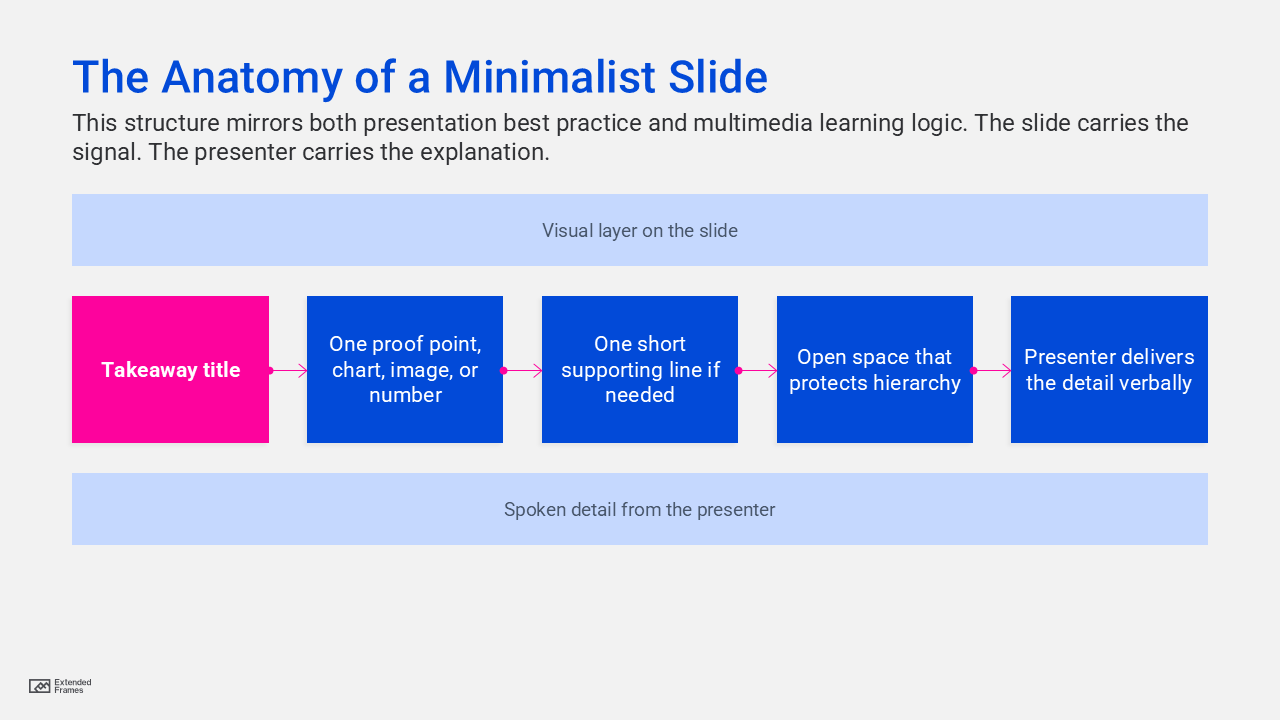
The anatomy of a minimalist slide
Minimalist presentation design for data slides
Data slides are where many decks stop being minimalist. The title is often generic, the chart is over styled, and the audience is expected to figure out the point on their own. Minimalist presentation design takes the opposite approach: first state the conclusion, then show only the evidence needed to support it. MIT explicitly recommends simplifying figures and using annotations to guide the audience to the key point.
A minimalist chart usually benefits from:
- fewer gridlines
- fewer colors
- direct labeling where possible
- one highlighted series
- a takeaway title that states the conclusion
- annotations on the key movement or comparison
The chart should not ask the audience to hunt for insight. It should reveal the insight quickly.
Where minimalist design often goes wrong
Minimalism can be powerful, but it can also become superficial. Minimalist design is useful only when it supports user needs, not when it is applied for style alone. In presentations, the same mistake appears when slides look elegant but lack enough context to persuade, explain, or guide action.
Another common mistake is weak contrast. W3C’s WCAG guidance requires at least a 4.5:1 contrast ratio for normal text and 3:1 for large text, specifically so text remains readable for people with low vision or impaired contrast perception. Microsoft echoes this guidance in PowerPoint by recommending sufficient contrast and warning against using color as the only way to convey meaning.
A third mistake is turning live text into artwork. W3C advises using text instead of pictures of text because people cannot alter how text looks inside images. For presentations, that matters in exported decks, shared PDFs, and accessibility workflows. Real text remains more readable, scalable, and adaptable.
What to keep and what to cut
| Keep | Cut or reduce |
|---|---|
| One takeaway title | Topic only titles |
| One key chart or visual | Multiple unrelated visuals |
| Short supporting text | Paragraphs on slides |
| One accent color | Several competing highlight colors |
| Consistent typography | Mixed fonts and decorative styles |
| Clear spacing and alignment | Crowded objects and edge to edge placement |
| Direct annotations | Unlabeled charts that need explanation |
| Real text and accessible contrast | Text embedded in images, faint text on busy backgrounds |
How to apply minimalist presentation design slide by slide
| Slide type | Minimalist approach | What to avoid |
|---|---|---|
| Title slide | One clear title, one supporting line, generous spacing | Overloaded cover with logos, dates, slogans, and extra text |
| Agenda slide | Short section list with clear grouping | Full paragraph agendas |
| Section divider | One statement that sets up the next part of the story | Decorative dividers that add no direction |
| Data slide | Takeaway title, simplified chart, one highlighted insight | Default chart styling with too many colors and labels |
| Comparison slide | Two or three rows of decisive criteria | Giant feature matrix with equal weight everywhere |
| Quote slide | One sentence quote, clear attribution, clean spacing | Long quotes in small type |
| Closing slide | Clear next step or call to action | Generic “Thank you” with no direction |
Accessibility is part of minimalist presentation design
Minimalist presentation design becomes stronger when accessibility is treated as a design standard. Microsoft recommends built in slide layouts because they preserve reading order for assistive technologies, unique slide titles because users rely on them to navigate, simple table structures for data, accessible font sizing, and sufficient white space.
That is useful beyond accessibility. These same habits improve the experience for everyone in the room. The cleaner the structure, the easier the message is to follow.
A simple checklist for every slide
Before finalizing a slide, ask these five questions:
| Question | If the answer is no |
|---|---|
| Is the takeaway obvious in the title? | Rewrite the title first |
| Does every element support that takeaway? | Remove anything extra |
| Is the first focal point clear within one second? | Strengthen hierarchy |
| Can the back row read it comfortably? | Increase font size and contrast |
| Would the slide still work if shared as a PDF? | Fix text, labels, and accessibility |
This is where minimalist presentation design becomes repeatable. It turns from a style preference into a review method.
Minimalist presentation design is not about saying less for the sake of aesthetics. It is about making the important things easier to see, easier to understand, and easier to remember. Research across usability, accessibility, and multimedia learning points in the same direction: remove the unnecessary, clarify hierarchy, keep text readable, and design every slide around a single message. When you do that, your presentation stops looking busy and starts becoming persuasive.